Flekh · Co-founder & design lead
Designing a shared place for creative feedback, revisions, and the work that follows.
In short · 30-second read
Flekh brings creative review, revisions and publishing into one place. I led its design end to end as one of three co-founders.
- Problem. Feedback lived in Drive, Docs and email, so no one could prove what was asked, even at payment time.
- My role. Co-founder and the only designer: research, product, design system, brand and marketing.
- Version control. Every version keeps its feedback, giving clients and editors one shared record.
- Beyond review. Grew from review into Publish and Task Manager, connecting the work that happens after approval.
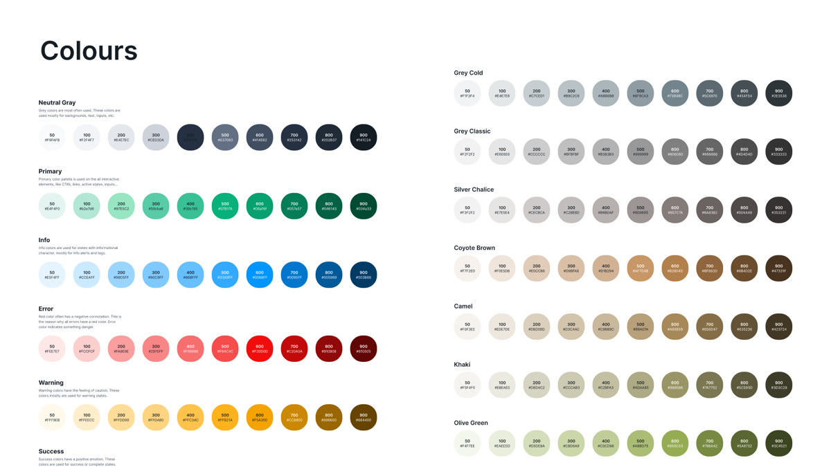
- Outcome. All three products in private beta, tested by about 30–35 creators.
- Lesson. Keep the first release small, and test why people would switch while you build it.
01 / The problem
Feedback lived everywhere except next to the work.
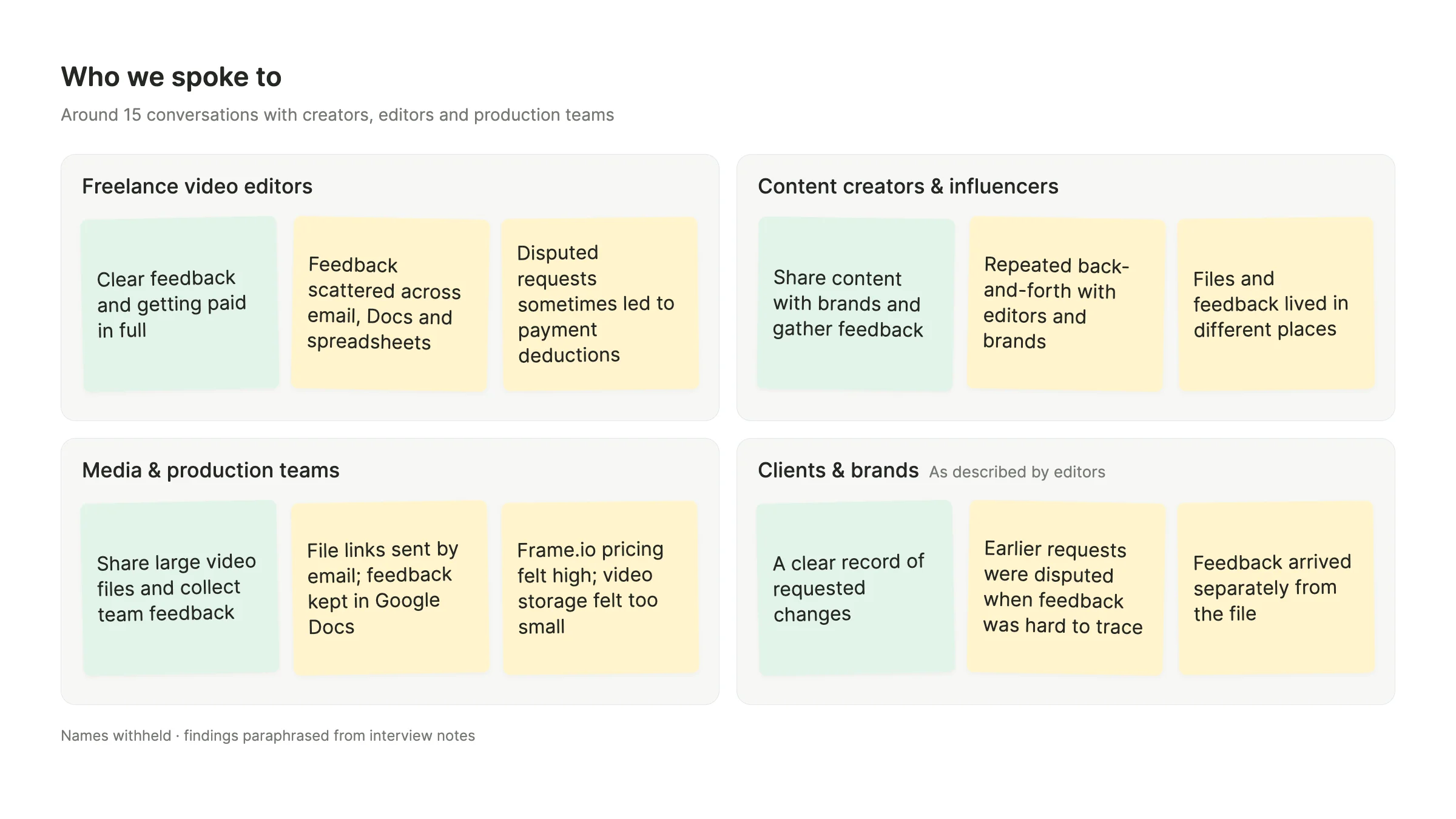
Creators shared files through Drive or email links, then collected feedback in Docs and spreadsheets. With the work and the conversation in separate places, revisions lost their context and accountability was hard to prove. I saw this first-hand while producing Neera Food Lab, then tested it in around 15 interviews with creators and editors.
- No shared record. Clients and editors disputed what had been requested, sometimes leading to payment deductions.
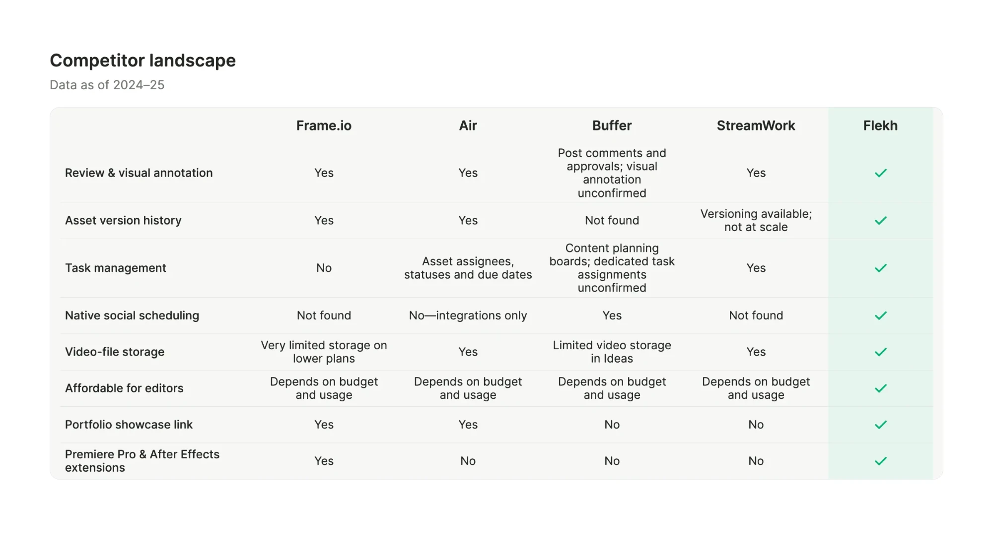
- Existing tools covered part of the job. Frame.io set the bar for video review, but for small teams of working editors, price and storage limits were a barrier, and task tracking and social scheduling still happened in other tools.
- Fragmented workflow. Review, publishing and task tracking happened in separate tools.
The goal. Keep the asset, its feedback and its history in one place.
02 / My role
Co-founder, and the only designer on the team.
- Design. Research, competitor analysis, user flows, product UI and the design system.
- Brand and marketing. Marketing website, product pages and emailers.
- Delivery. Tested each release, logged bugs, and set up PostHog and Google Tag Manager for product and marketing analytics.
Two co-founders built the frontend and backend. The first three months focused on concept and design; edge cases, marketing and QA continued alongside development. Flekh was a passion project for all three of us, and we scoped each release tightly to keep it moving.
 Competitors
 Research
 Product

Competitor landscape: Frame.io, Air, Buffer and StreamWork each covered part of the workflow; none combined review, tasks and social scheduling.
03 / The core loop
Upload, share, review, revise.
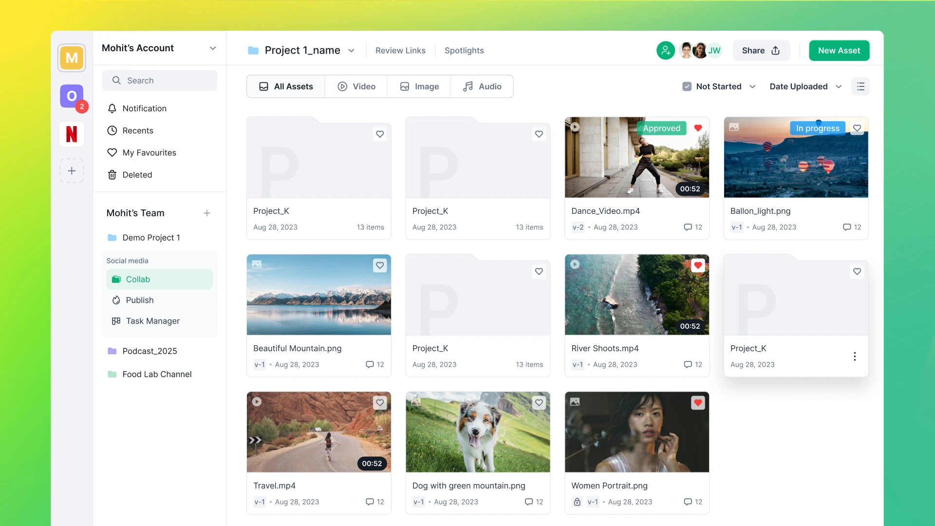
The first release, Collab, was built around one loop that replaces the Drive-and-Docs routine. We set a six-month target to launch it.
- Upload. Add an asset or a whole folder, publicly or privately.
- Share. Send a review link; reviewers sign in to leave feedback.
- Review. Feedback lands on the frame itself, not in a separate document.
- Revise. Upload the next version and the loop starts again, with its history intact.
04 / Collab
Everything a review needs, on the work itself.
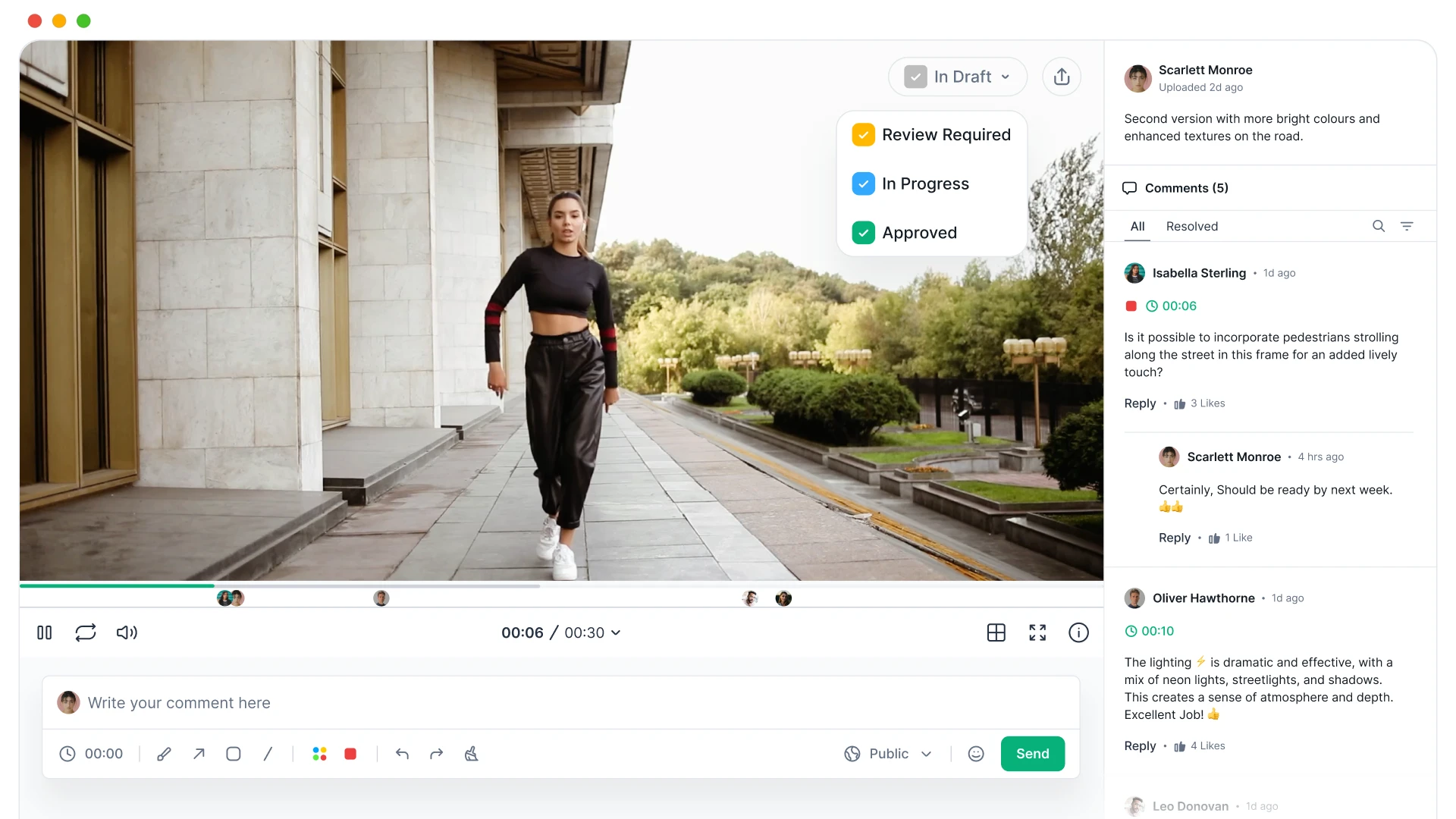
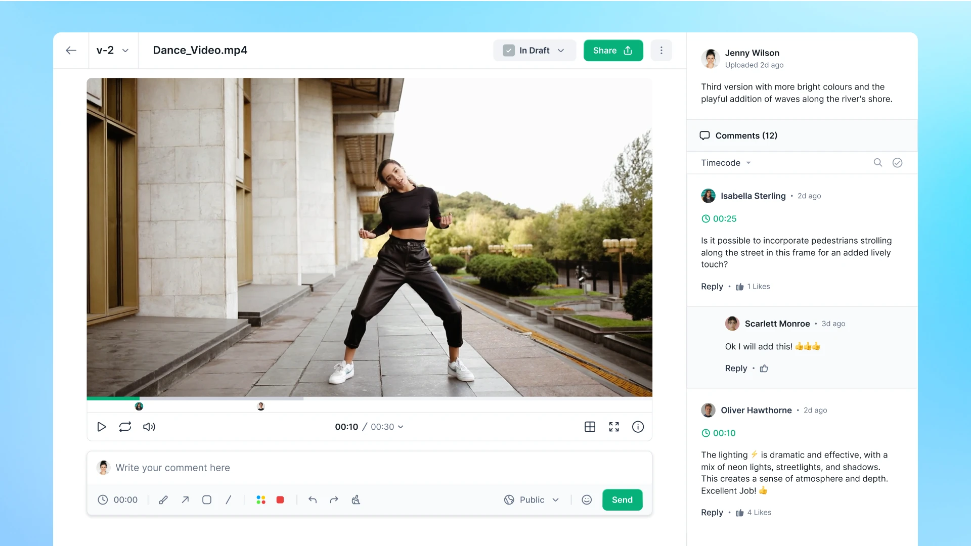
Collab is where an asset gets reviewed. Instead of describing a change in a separate document, reviewers point to it on the frame, and the conversation stays attached to that moment.
- Annotate the frame. Draw, add arrows, shapes and colour directly on a paused frame.
- Timestamped comments. Every comment is pinned to a moment, shown as an avatar on the timeline.
- Threads. Reply, like, mention teammates, and mark comments resolved.
- Public or private. Choose who sees each comment, and make whole assets private.
- Approval status. Move work from In draft to Review required, In progress and Approved.
- Teams and roles. Invite people by email and set them as admins or team members.
05 / Version control
A new version never erases the old conversation.
Version control came straight from the payment disputes in our research: both sides needed a record of what was asked and what changed.
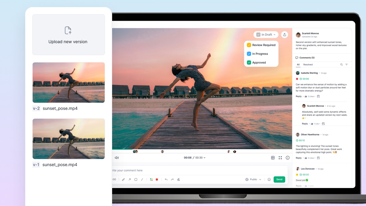
- New versions. Upload a revised file to the same asset and it becomes v-2, v-3 and so on.
- Comments stay put. Each version keeps its own feedback, so earlier notes are never lost.
- Switch versions. Move between versions from one menu to see what changed.
- Status per version. Mark each one In draft, Review required, In progress or Approved.
06 / Publish
From an approved cut to a scheduled post.
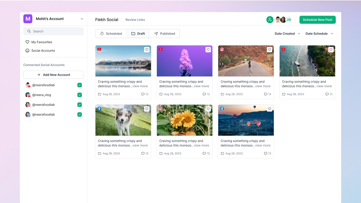
Review alone didn't give teams a strong reason to switch tools, so Flekh carried on past approval. Publish takes finished work straight to social channels.
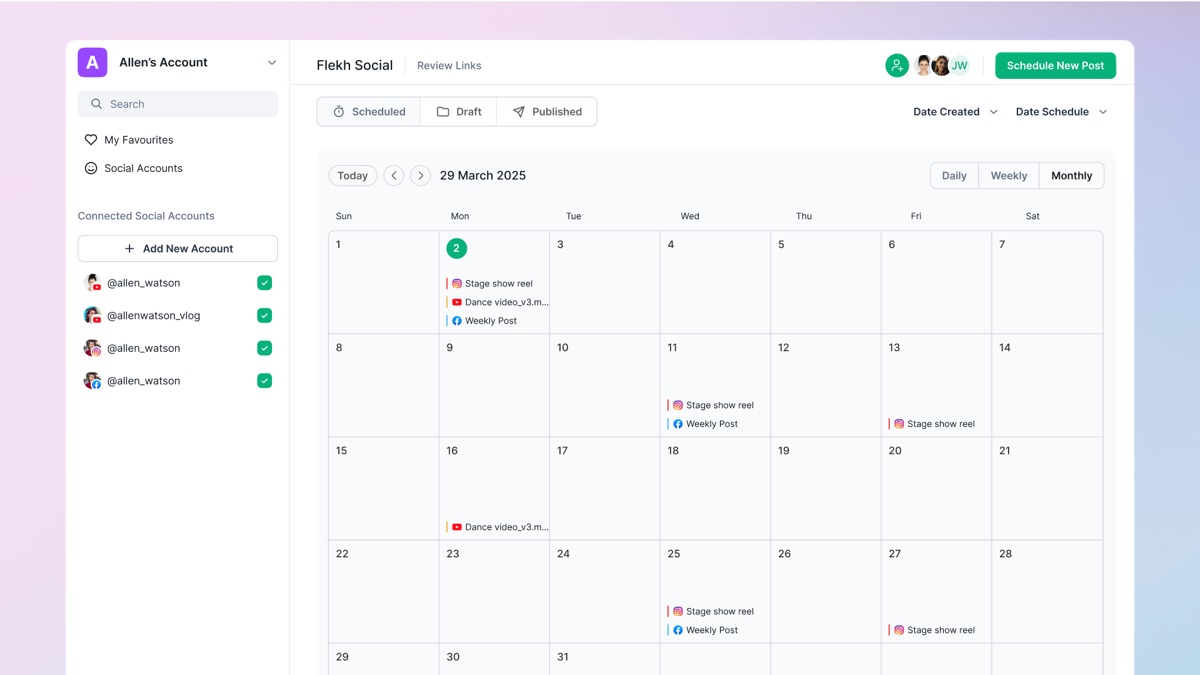
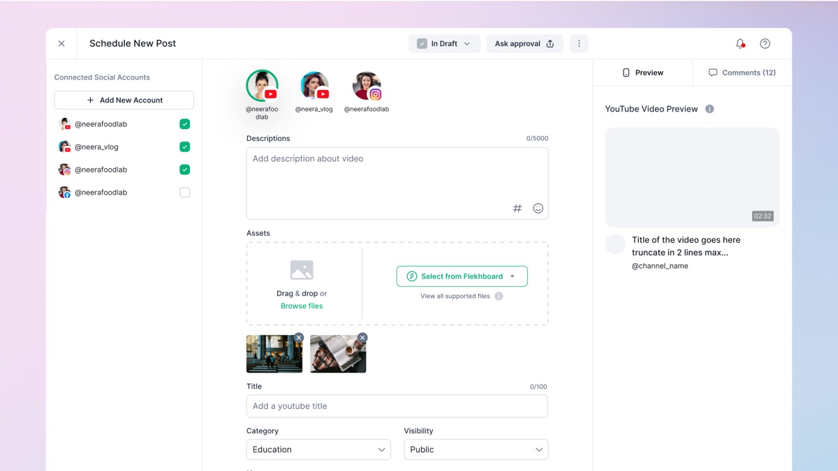
- Connected accounts. Link several social accounts, such as Instagram, YouTube and Facebook, and choose which ones each post goes to.
- Scheduled, draft, published. Every post sits in one of three tabs, so nothing gets lost between approval and going live.
- Calendar. See what goes out when, by day, week or month.
- Compose a post. Write the description, pull assets straight from Flekh, preview it per platform, and ask for approval before it goes out.
07 / Task Manager
Feedback that turns into work.
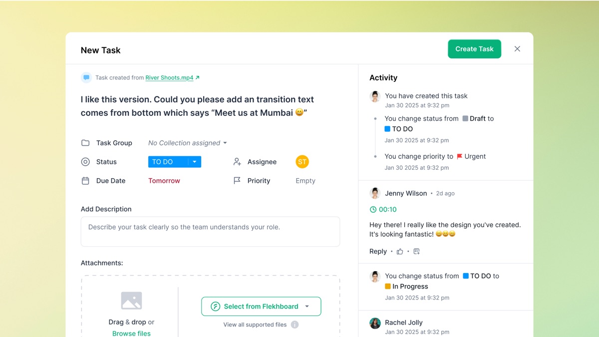
A comment is only useful if someone acts on it. Task Manager turns feedback into assigned work and keeps track of it until it's done.
- Task from a comment. Create a task directly from a review comment; it links back to the asset it came from.
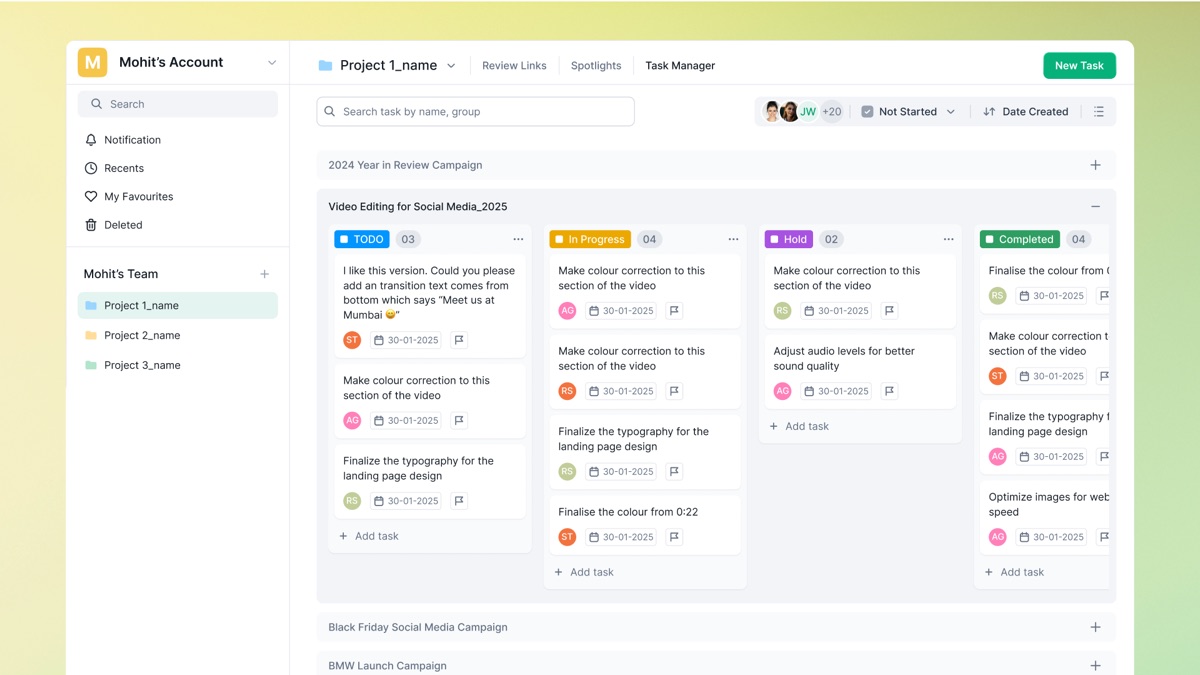
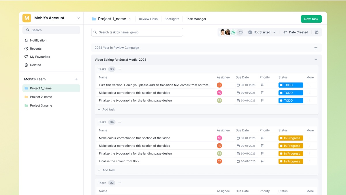
- Board or list. Track work by status (To do, In progress, Hold, Completed) as a board, or as a list with assignee, due date and priority.
- Grouped by project. Tasks sit in groups such as a campaign, so each project's work stays together.
- Activity log. Every change to status, priority or assignee is recorded alongside the comments.
08 / Design system
Speed over originality, by design.
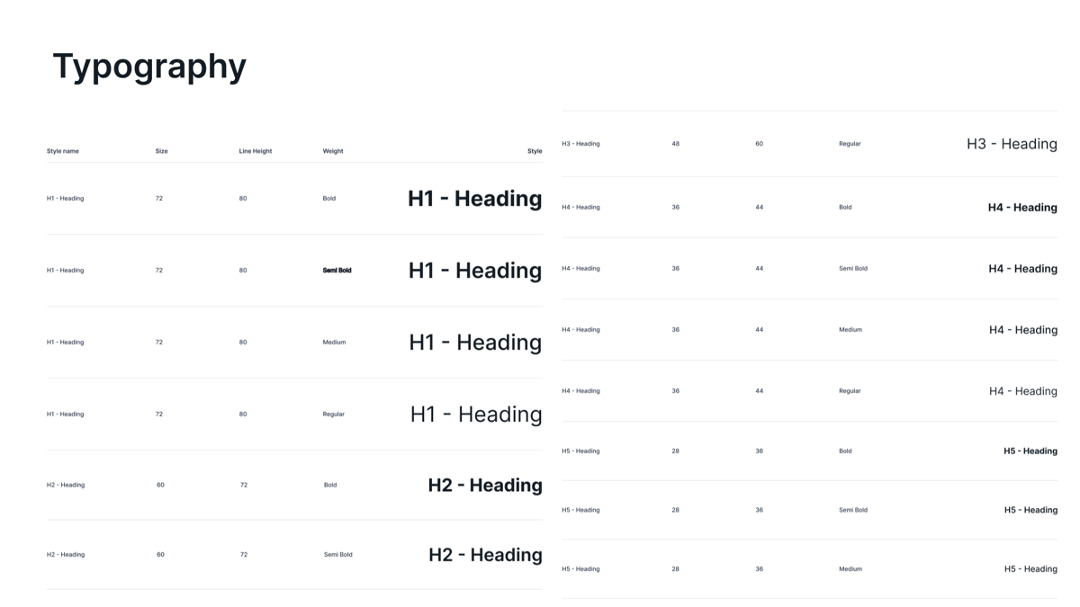
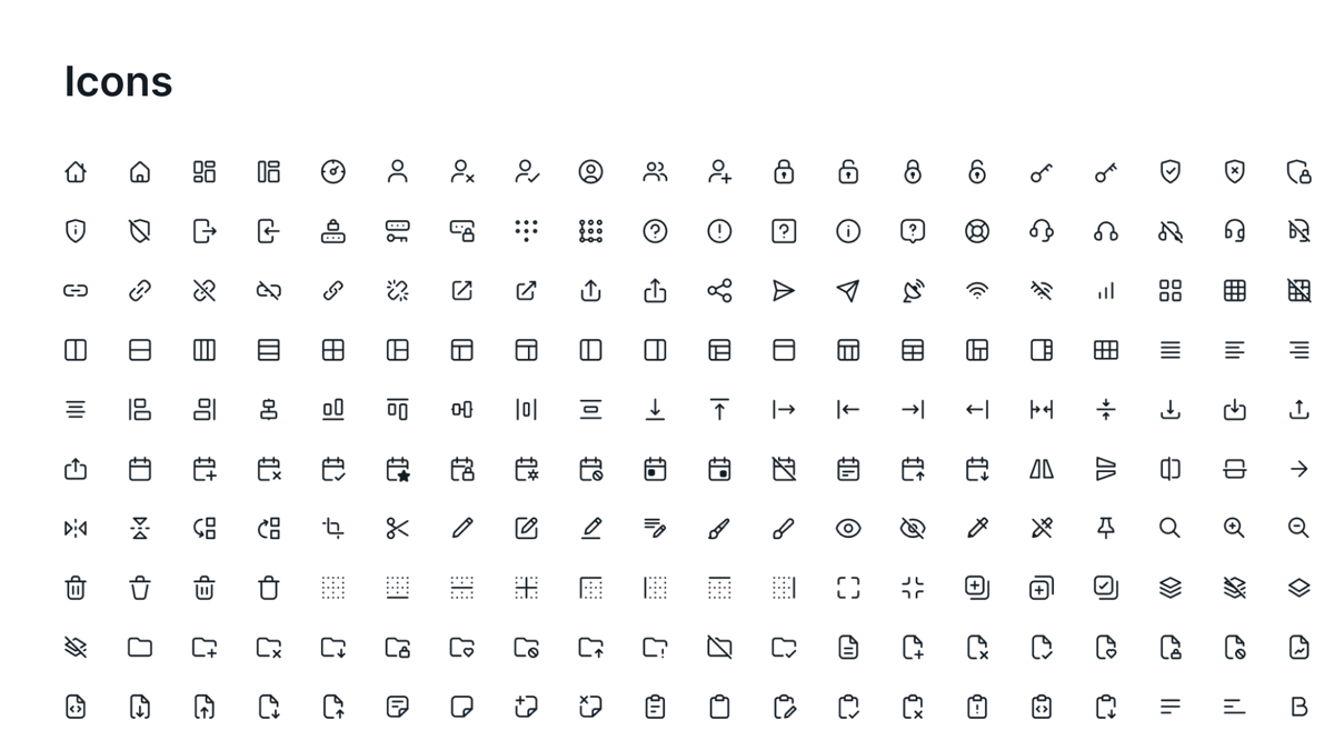
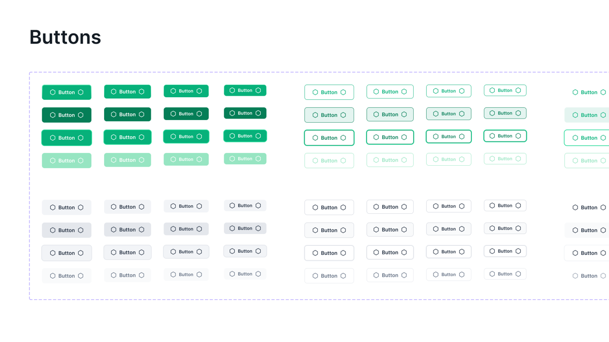
With the product likely to grow, I built on shadcn/ui rather than starting from scratch, adding Flekh's green brand palette on top. This kept our time on research and flows; a bespoke system could follow once the product was validated.
- Stable. Buttons, colour and iconography stayed largely unchanged.
- Evolving. Cards, forms and light/dark theme variables grew with each new product area.
- Shared. Documentation lived on one board, giving developers a single reference.
09 / Brand and marketing
Taking Flekh to the people it was built for.
Design didn't stop at the product. I also owned how Flekh looked and sounded in public: the brand, the website, and the channels where creators would first hear about it.
- Brand. The product UI stayed calm and functional; marketing used Flekh's green with bolder grotesque type, blur effects and vector graphics to give the brand more energy.
- Website. I designed flekh.com , its product pages and the emailers. As Flekh grew to three products, the site's job became explaining how they worked together.
- Social channels. I ran Flekh's Instagram, X (Twitter) and LinkedIn, posting regularly to build an audience and engagement among creators.
- Video. I made the marketing and promotional videos, from product walkthroughs to launch promos, showing what Flekh does in seconds.
10 / Outcome
All three products live in beta.
Collab, Publish and Task Manager were all in private beta when I stepped away, with the marketing site public. Testers picked up the core flows quickly; the main issues were reliability in commenting and annotation, which I logged for the development team.
11 / Learnings
What I'd carry into the next product.
Product
- Test the “why us” early. We spent six months refining Collab before asking why anyone would switch to it. A few conversations about the tools editors would leave, run alongside the build, would have shown the gap much earlier.
- Keep the first release small. Launching Collab on its own got real feedback fast, and Publish and Task Manager grew out of what we learned.
- Plan for growth in the architecture. As Publish and Task Manager arrived, cards, forms and theme variables kept changing. Designing with all three in mind would have saved rework.
Design
- Context is the product. Every key interaction came back to one idea: keep feedback attached to the exact frame and version it's about.
- Borrow the foundation, design the details. Starting from shadcn/ui let a three-person team move fast, so design time went into flows and edge cases rather than buttons.
- Test the hardest interaction early. Most beta issues were in commenting and annotation. Testing those with real video files sooner would have caught them before launch.
Business
- Pricing is part of the product. Editors we spoke to rated the leading review tools highly but were held back by price and storage. Those limits shape the experience as much as the UI does.
- Measure from the first release. I set up PostHog and Google Tag Manager early, so we could see where users came from and what they used, instead of guessing.
- Distribution starts on day one. Running the brand, social channels and videos myself showed me that a good product still needs a steady way to reach people.
Good ideas start with a conversation.
Start a conversationAway from the keyboard. I reply within a day.