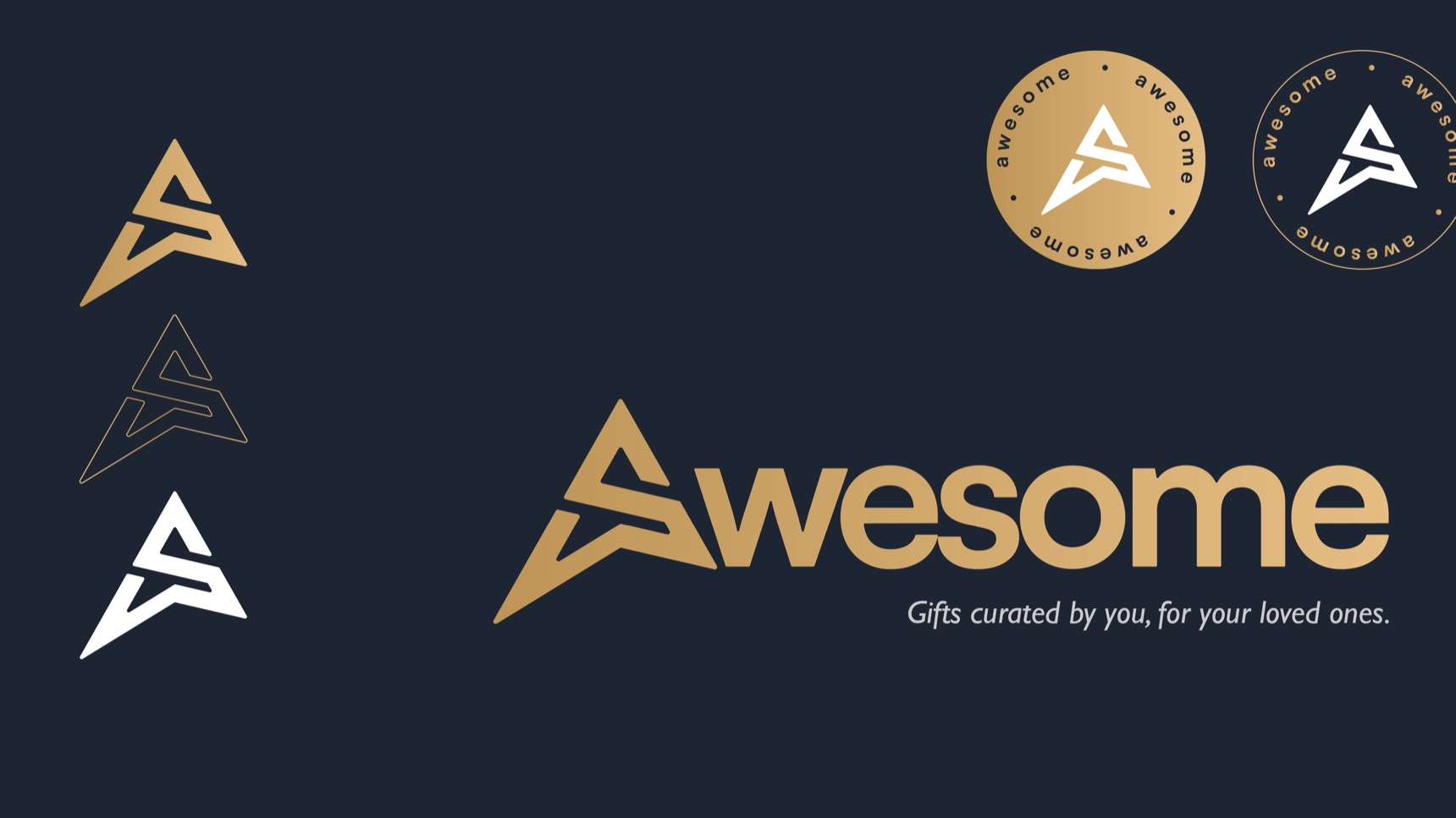
Awesome · Logo & brand identity
One letter that reads as two, for a brand about thoughtful gifts.
In short · 30-second read
Awesome helps people create personal gifts for the people they love. I designed a wordmark whose A also reads as an S, and a gold identity that feels premium and caring.
01 / The brief
A logo that feels like opening a good gift.
Awesome lets people curate meaningful, personalised gifts for their loved ones. The audience is broad: people of all ages who want to give something that feels personal.
- Memorable. Stand out and stay in mind.
- Modern and sleek. Reflect a service that is intuitive to use.
- Caring. Carry a sense of thoughtfulness, not just commerce.
The name itself was a strategic choice: “awesome” is exactly the excitement and delight people feel when they give, or receive, the right gift.
02 / The monogram
An A that is also an S.
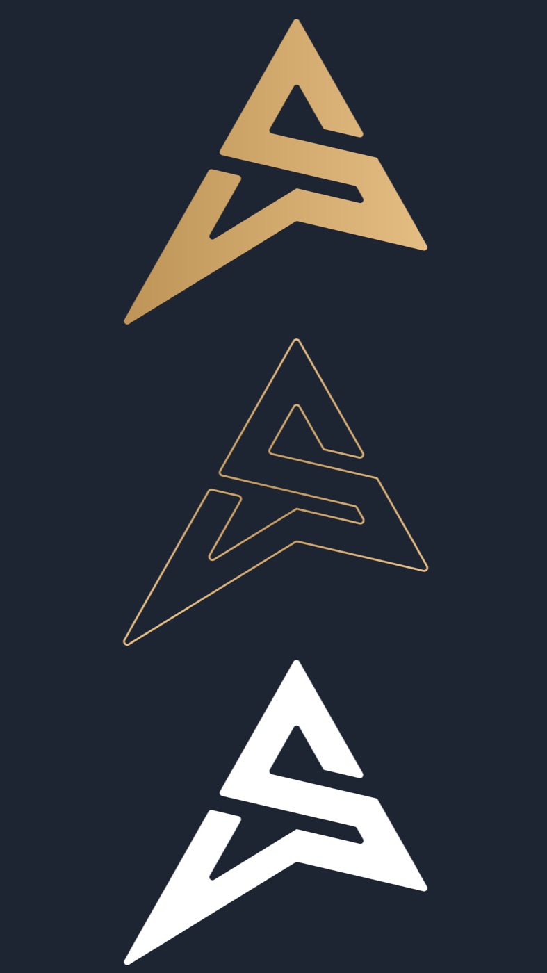
While exploring sans-serif wordmarks, the capital A became the focal point. I drew it so its inner stroke folds into an S, so the letter reads as both, a small surprise that reinforces the name’s positive feeling.
- Why
- A hidden second letter gives people something to discover, the same small delight as a well-chosen gift.
- Double duty
- On its own, the A works as a favicon and app icon, keeping the brand recognisable in browser tabs and bookmarks.
03 / Process
Four steps, worked out with the client.
- 01Understand the vision
Close sessions with the client on brand values, audience and how they wanted to be seen: memorable, easy, caring.
- 02Explore concepts
Brainstorming and sketching wordmarks in clean sans-serifs, until the A took centre stage.
- 03Design for small sizes
Shaping the A to stand alone as a favicon, so the brand holds up across the whole customer journey.
- 04Refine and colour
Refining the A with the client until both letters read clearly, adding the tagline, and choosing gold.
04 / Identity
Gold, navy and a quieter tagline.
- Wordmark. “Awesome” in a bold sans-serif, led by the A/S monogram.
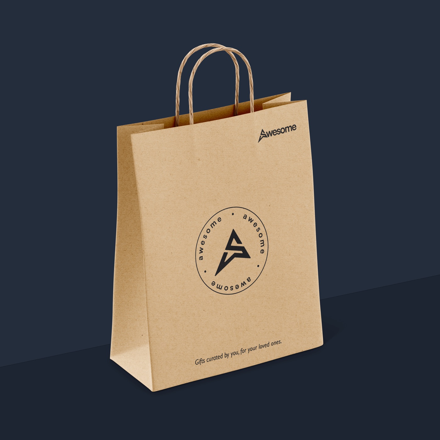
- Tagline. “Gifts curated by you, for your loved ones” sits in a smaller, more delicate face, so the name leads and the promise follows.
- Gold. A soft gold gradient on deep navy conveys luxury, quality and thoughtfulness.
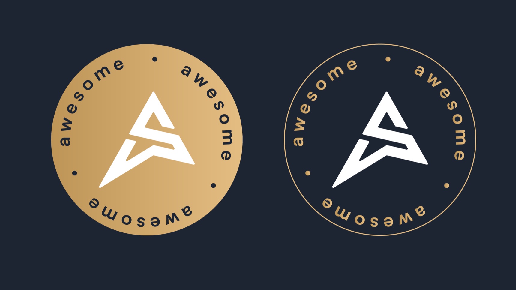
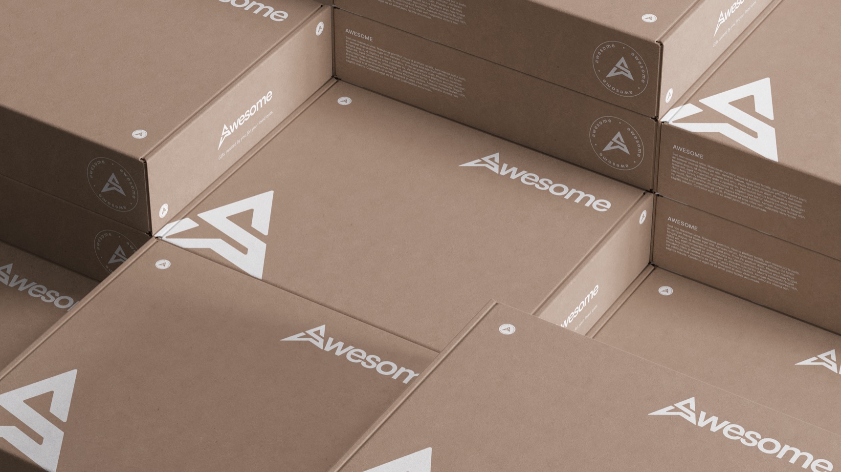
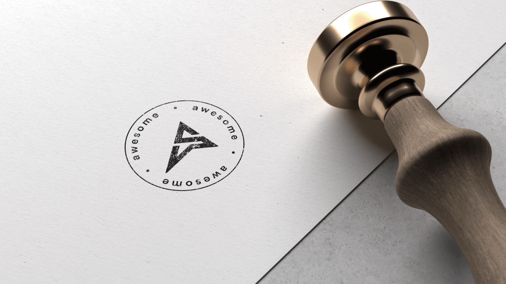
- Seal. The monogram inside a ring of repeated “awesome” lettering, for stamps, stickers and packaging.
05 / In use
Made to be unwrapped.
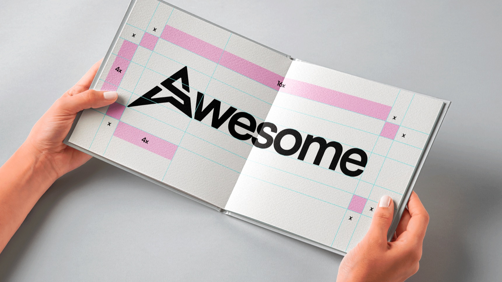
For a gifting company, the packaging is the brand’s first impression. The identity works in white on kraft, in black on paper bags, and stamped by hand.
06 / What the client said
“You absolutely nailed it.”
“I absolutely love the logo you designed for our gifting solution company! ‘Awesome’ is exactly the feeling we want our customers to experience when using our service. The logo is bold and memorable, and the tagline ‘Gifts curated by you, for your loved ones’ perfectly captures our value proposition. The gold color scheme is elegant and conveys a sense of quality, which is important to us. I also appreciate the delicate font used in the tagline: it adds a touch of thoughtfulness and care, which aligns perfectly with our brand. Thank you for taking the time to understand our needs and target audience. You absolutely nailed it! I can’t wait to see this logo come to life across all our marketing materials.” — Awesome, client
07 / Learnings
What I took from it.
- Let one detail carry the idea. A single letter doing two jobs made the whole identity memorable.
- Design the smallest size early. Shaping the A as a favicon from the start kept it strong everywhere else.
- Bring the client into the refining. Reviewing the A together is why both letters read clearly in the end.
Good ideas start with a conversation.
Start a conversationAway from the keyboard. I reply within a day.