KPCA · Logo & brand identity
Designing an identity that carries a community’s heritage into the present.
In short · 30-second read
KPCA wanted a logo that honours Kashmiri Pandit heritage and still feels modern. I combined the lotus and the dejhoor into one mark built from concentric circles.
- Problem. A rich cultural background, but an existing visual identity without a cohesive style.
- Idea. Fuse two symbols: the lotus for purity and enlightenment, the dejhoor for prosperity and auspiciousness.
- Craft. Every curve comes from the intersections of concentric circles.
- System. Futura PT, deep pink and marigold, in stacked and horizontal lockups.
- Outcome. Launched at a community event and praised by the client for bridging tradition and modernity.
01 / The brief
A heritage worth showing, without looking old.
The Kashmiri Pandit’s Cultural Association brings the community together through culture and celebration. Its heritage is rich in symbols, but its visual identity lacked a cohesive style. KPCA asked for a logo that captured the essence of that heritage while resonating with modern audiences, young and old.
The goal. One mark the community would recognise instantly, clean enough to work on a business card, a banner and a billboard.
02 / Two symbols
The lotus and the dejhoor.
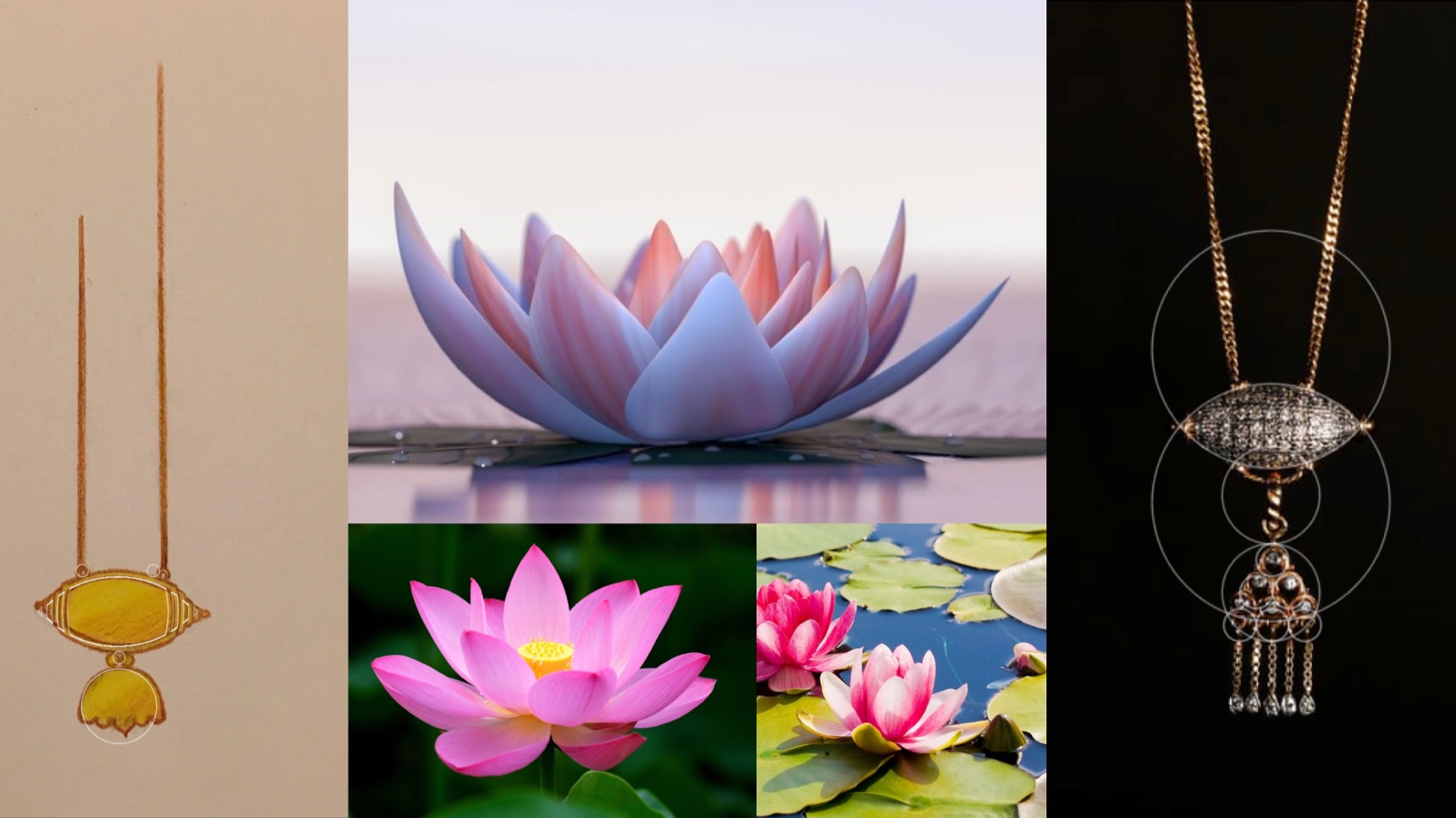
I started from two symbols that are instantly recognisable in Kashmiri culture, and looked for the point where they could become one form.
The lotus
A symbol of purity and enlightenment. Its open petals give the mark its silhouette and its upward energy.
The dejhoor
A traditional Kashmiri ornament, symbolising prosperity and auspiciousness. It becomes the base the lotus rises from.
03 / Construction
Built entirely from circles.
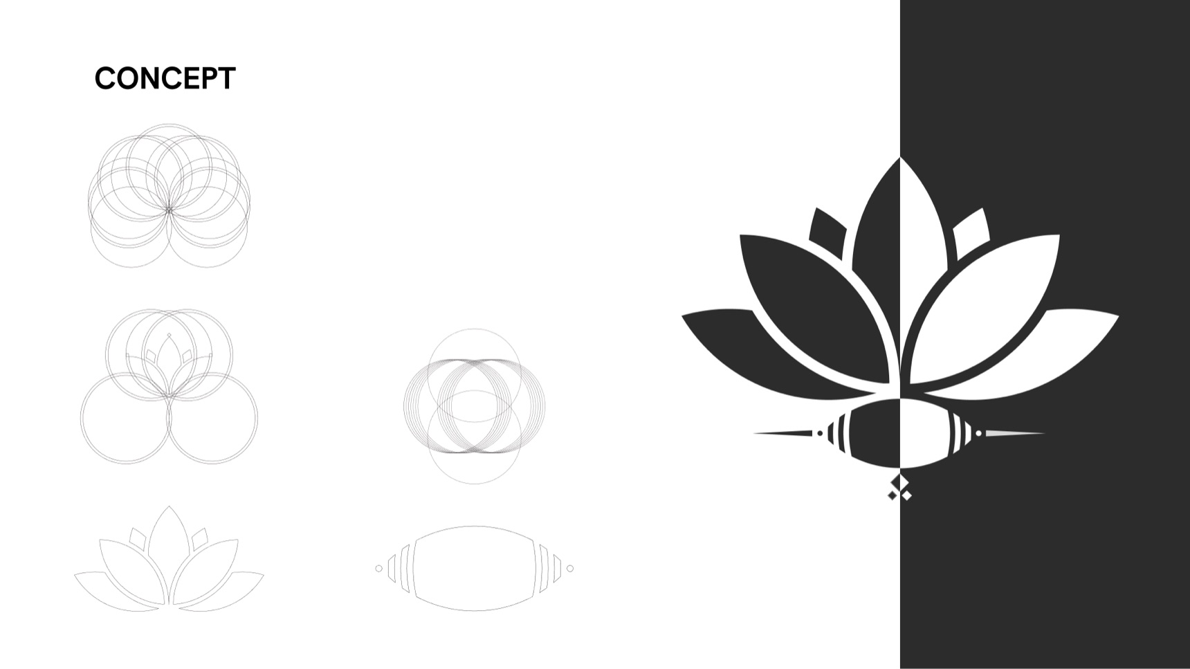
The mark uses a minimalist geometric approach: every petal and the dejhoor’s body are cut from the intersections of concentric circles. The construction gives a clean, modern feel, while the forms keep their cultural meaning.
- Why
- Circles give every curve the same rhythm, so two very different symbols read as one mark.
- Trade-off
- Simplifying sacred symbols risks losing them, so each shape had to stay recognisable to anyone familiar with Kashmiri symbolism.
04 / Identity system
Futura, deep pink and marigold.
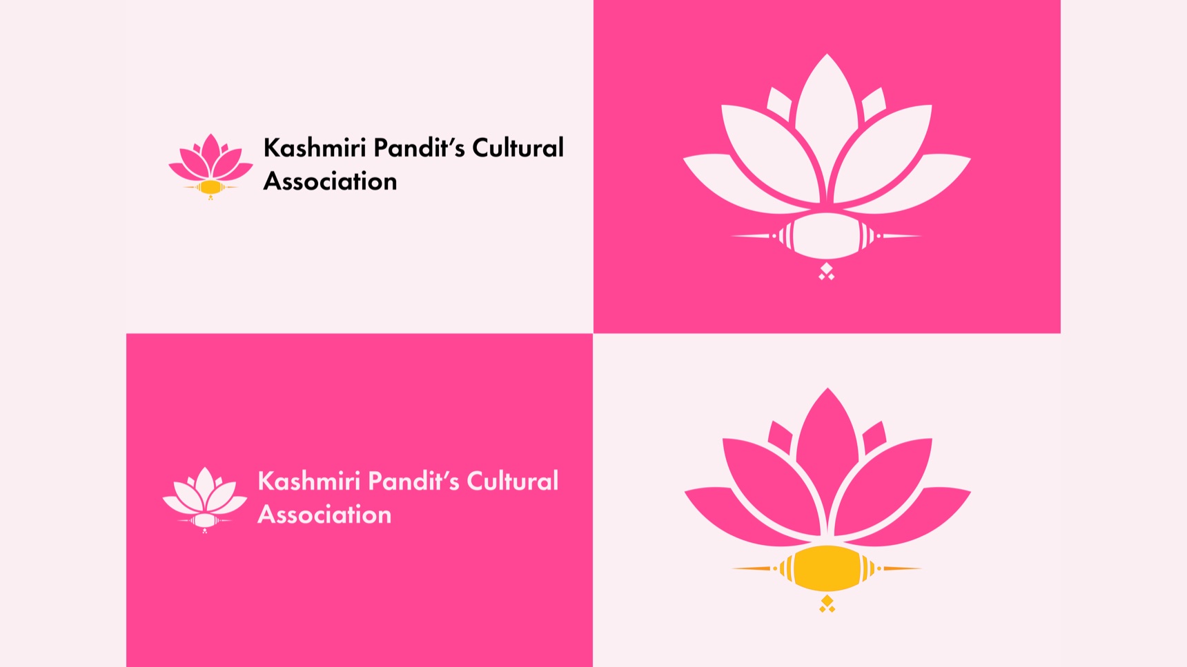
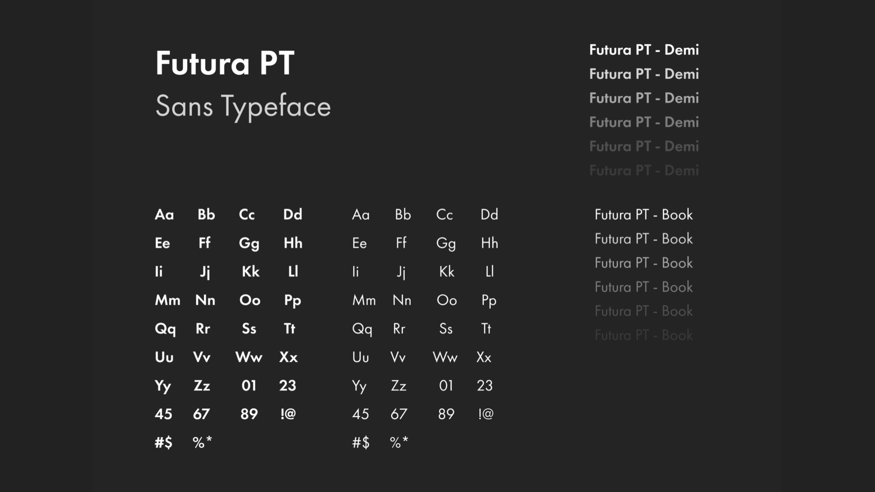
- Futura PT. Its clean, geometric lines echo the circles in the mark and the association’s forward-looking spirit. It works at every size, in print and on screen, and its simplicity balances the traditional symbols.
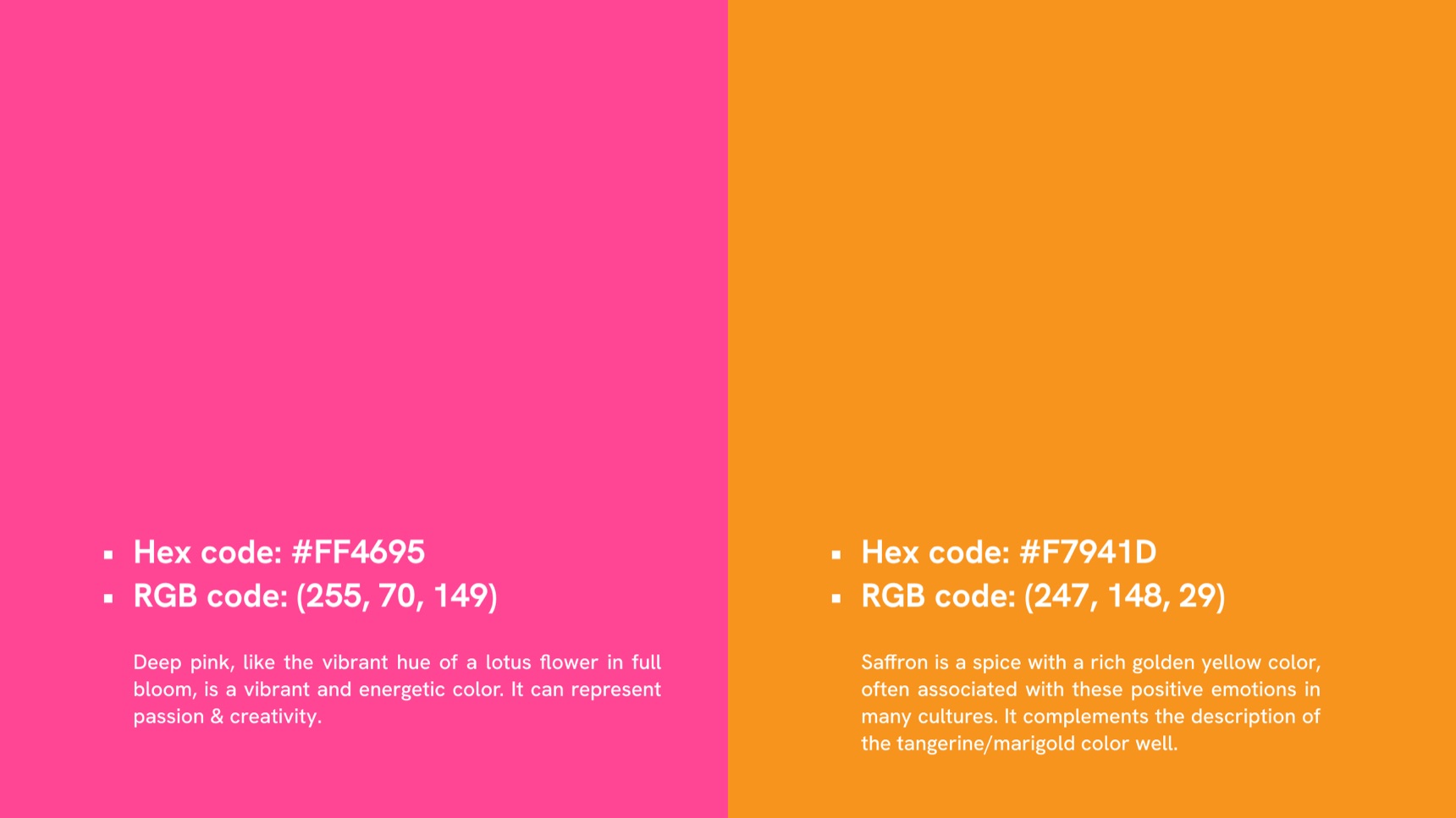
- Deep pink, #FF4695. The vibrant hue of a lotus in full bloom: energy, passion and creativity.
- Marigold, #F7941D. A rich golden shade that evokes saffron and the warmth of Kashmiri culture.
- Lockups. A stacked mark with KPCA spelled out, and a horizontal version with the full name, each in colour and in white on pink.
05 / Applications
From a business card to a billboard.
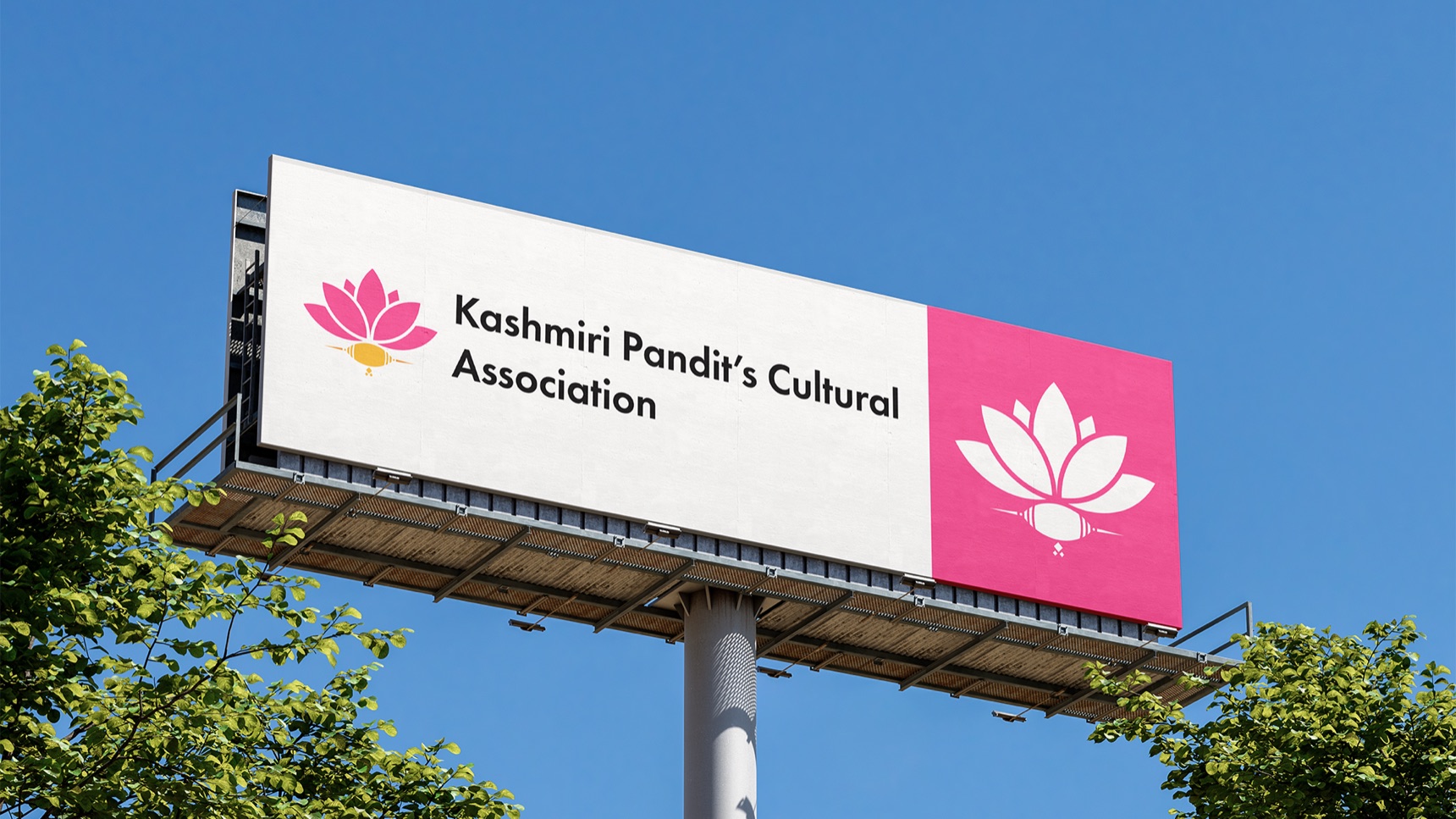
I tested the identity across the places the association shows up: signage, outdoor and airport displays, roll-up banners for events, and stationery. The geometric mark holds up from a few millimetres to a full billboard.
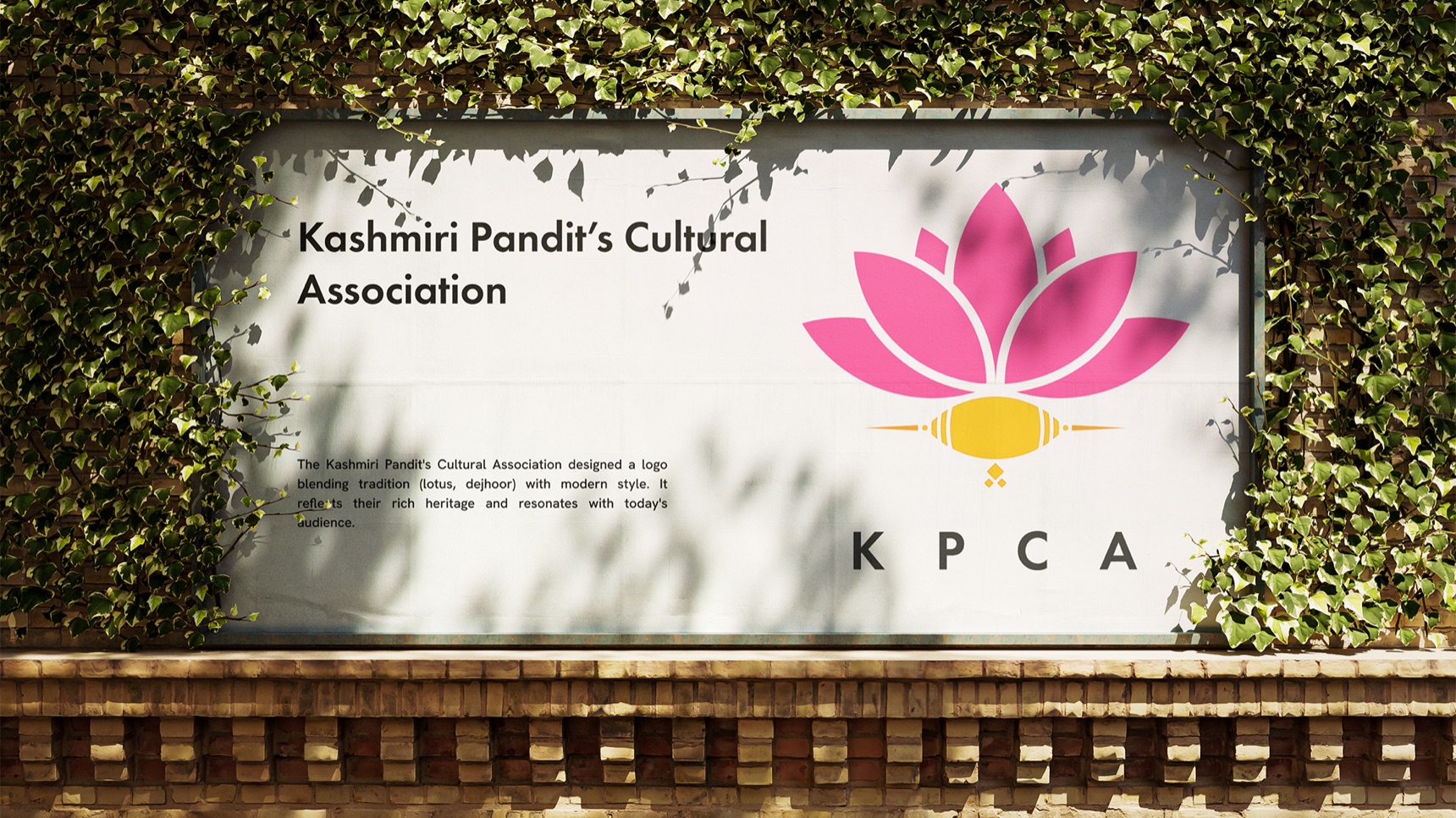
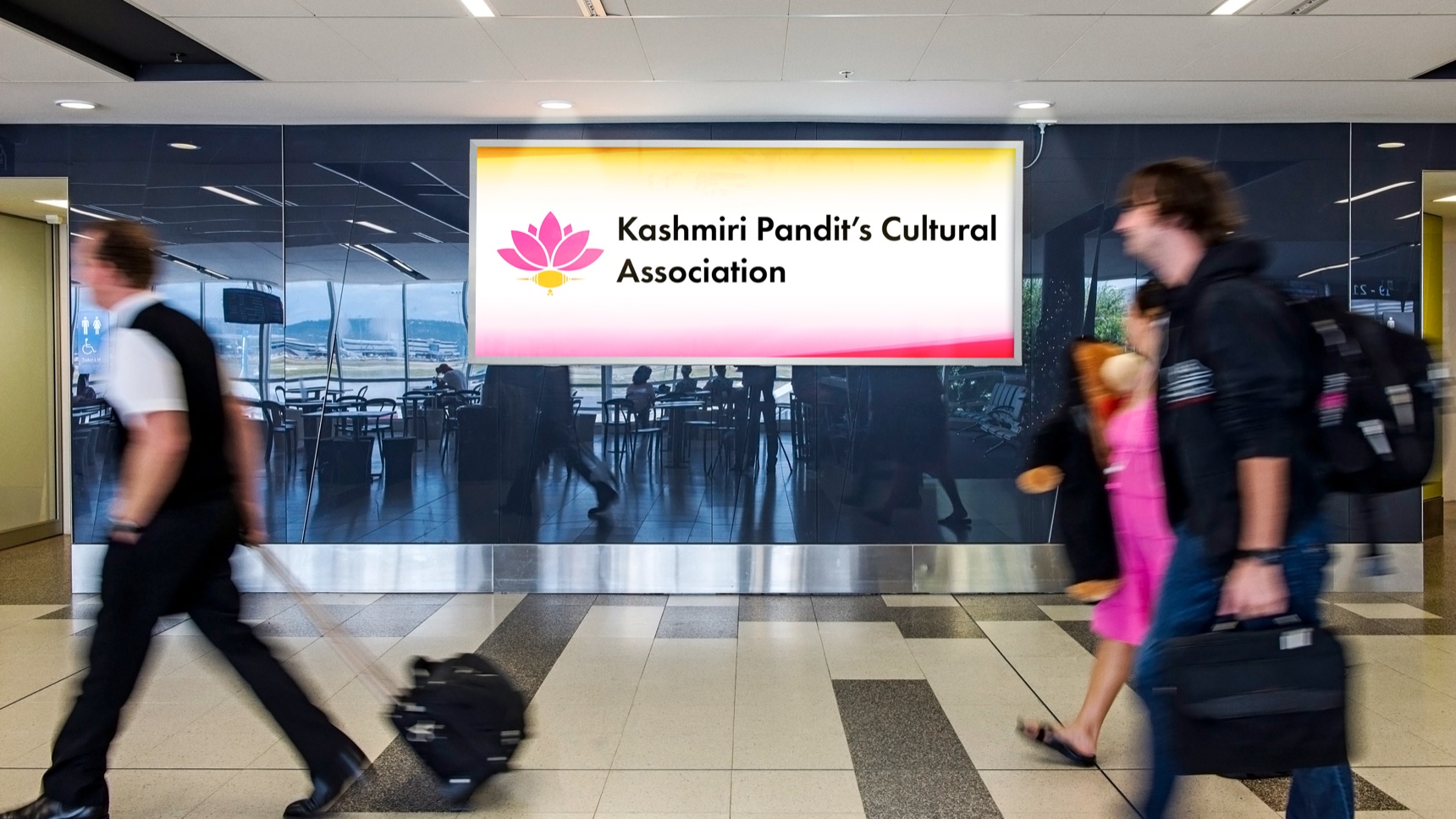
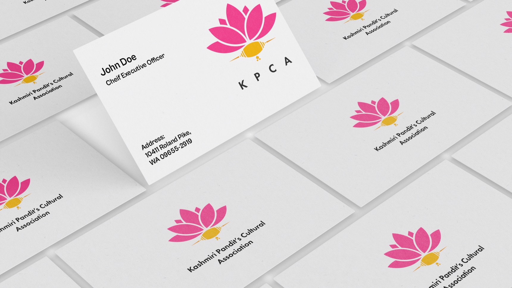
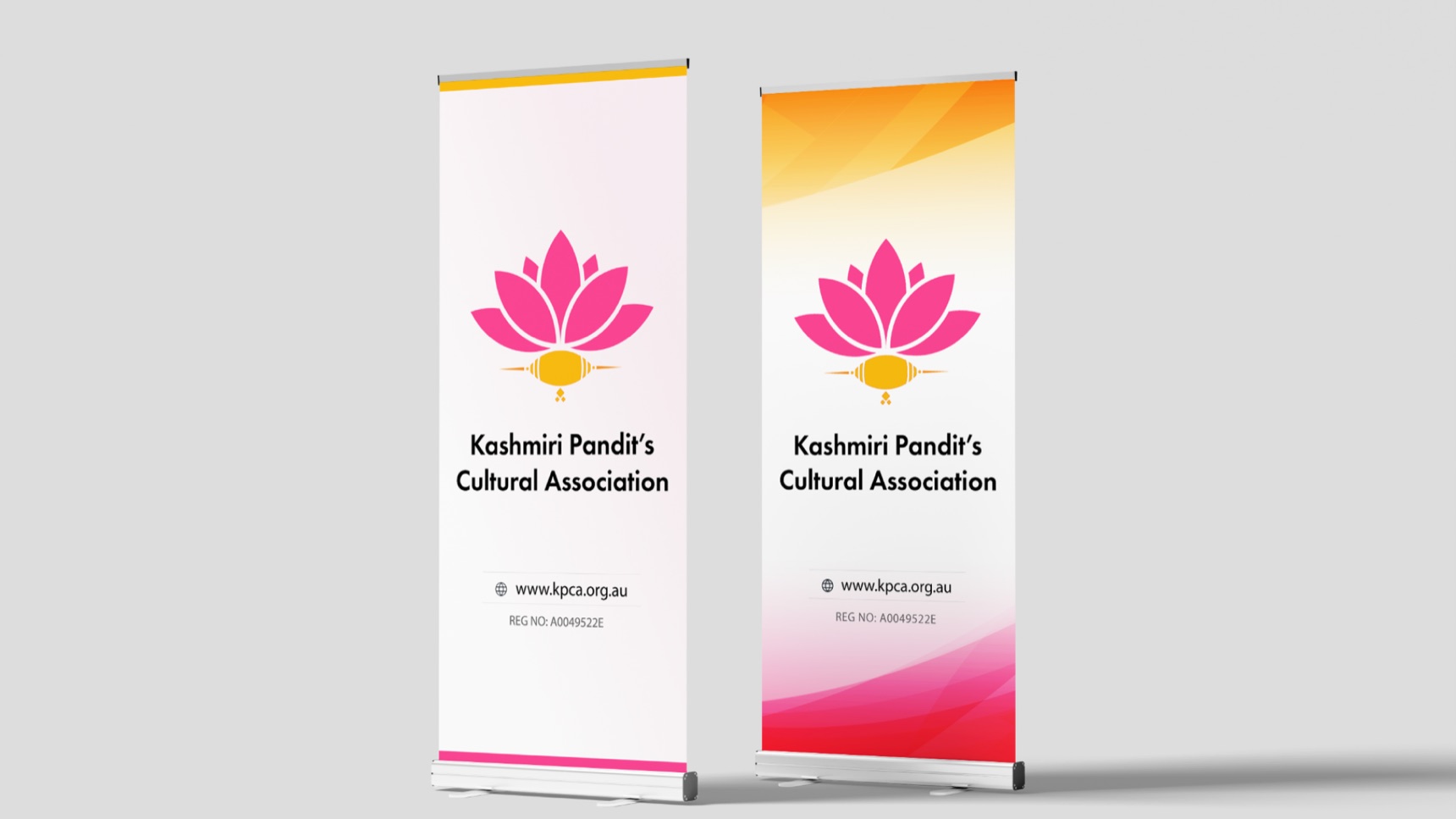
Wall signage: the full name, a short description, and the stacked mark.
06 / Launch
In the room with the people it was made for.
The new identity was launched at a KPCA community event, on the welcome sign and the stage banners. The lotus and the dejhoor were recognised straight away, and the client praised the logo for bridging tradition and modernity.
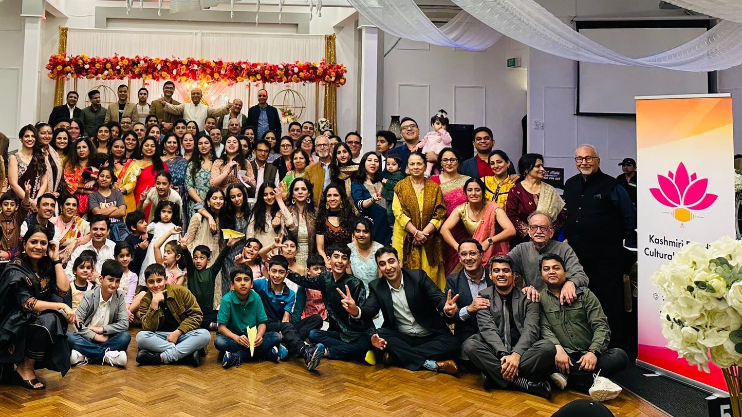
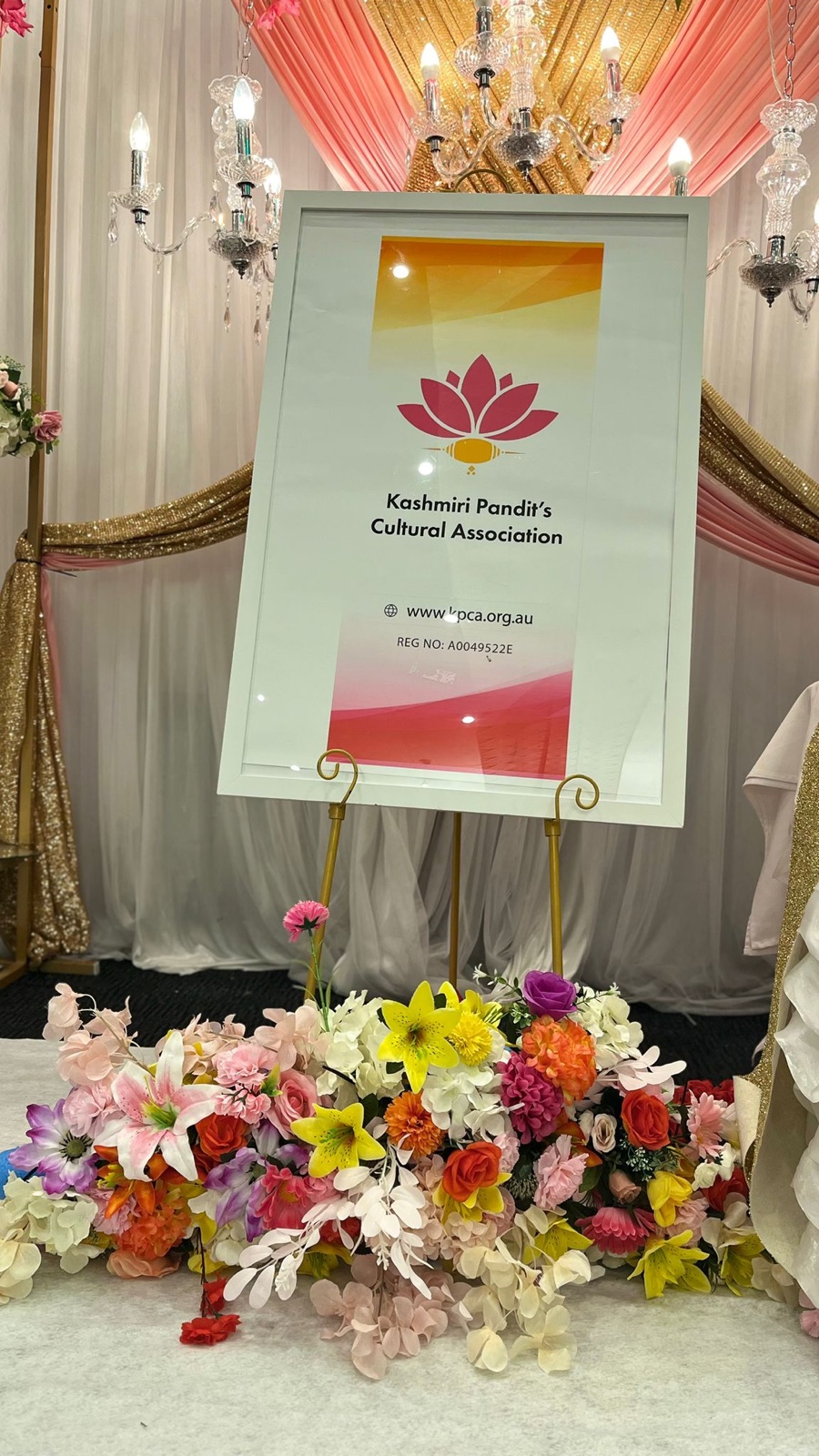
“I highly recommend Rahul for designing the KPCA community logo. He showed professionalism and delivered exceptional quality work that was worth the cost. He was responsive and engaged throughout the logo design process, demonstrating patience, passion, and an understanding of our community’s needs. Rahul communicated consistently and effectively, resulting in a logo that aligned with our requirements. Despite facing challenges, he remained committed and his expertise resulted in a memorable logo for KPCA. Great job, Rahul! Keep up the exceptional work.” — Kashmiri Pandit’s Cultural Association
07 / Learnings
What this project taught me.
- Meaning first, geometry second. The symbols had to be right for the community before the construction could make them modern.
- One rule can unite two forms. Building everything from circles is what lets a flower and an ornament read as one mark.
- See it where it will live. Testing on banners, signs and cards early showed which lockup each place needed.
Good ideas start with a conversation.
Start a conversationAway from the keyboard. I reply within a day.