OurKarma · Brand & web design
Designing a brand and website that turn giving into something you get back.
In short · 30-second read
OurKarma is a charitable marketplace: donate to a cause, earn karma credits, spend them with partner businesses. I designed its identity and website, from research to handoff.
- Problem. People wanted to give, but couldn’t find causes that fit their time, or see what their giving achieved.
- Brand. A cairn of four stepping stones: one mark for progress and balance that also carries the palette.
- Research. 10 interviews, 5 usability tests and a review of Goodr, Givebutter and Impact Hub.
- Product. Three ways to find a cause, then one route from donation to a voucher redeemed in store.
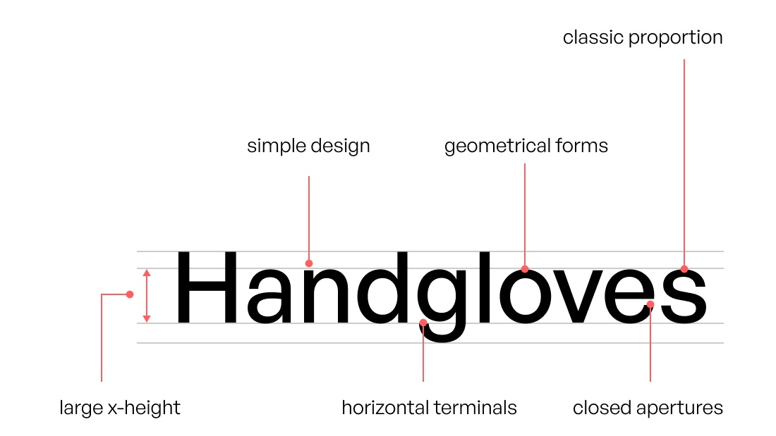
- System. A Figma system in General Sans and OurKarma violet, handed off in locked sections.
- Lesson. Tie every research finding to the screen it shaped.
01 / The brief
Make giving feel rewarding, not just right.
OurKarma is a social enterprise that connects generous people with businesses, not-for-profits and communities. Every donation earns credits that can be spent with partner businesses on coupons, surprise rewards and experiences. My job was to give the idea a face and a home: first the brand, then the website it lives on.
Bridging the gap. Bad news makes it easy to lose sight of the many communities still working to make a difference. OurKarma set out to connect generous givers with the businesses that want to support them, and build a culture where good deeds are not only encouraged but rewarded.
- 01Give
Donate to an initiative or a charity, publicly or privately.
- 02Earn
Receive karma credits, confirmed by email with the payment receipt.
- 03Choose
Spend credits on an offer from a partner business.
- 04Redeem
Show the QR voucher in store, then share the deed with friends.
Part one
The brand
02 / The mark
A stack of stepping stones.
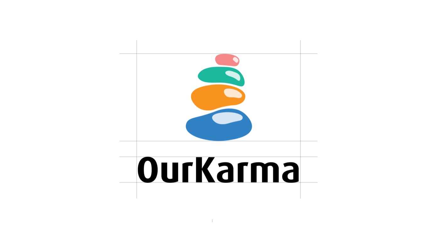
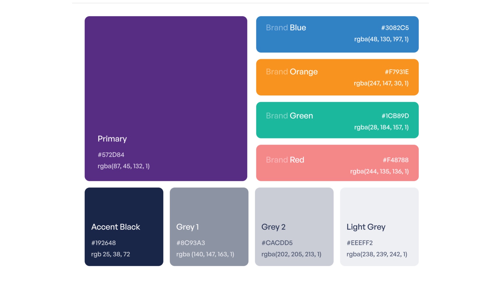
The logo is an abstract cairn: four stones, each one a step forward. Balanced stones read as calm and as progress at once, which suited a brand about small deeds adding up. Each stone carries one of the four brand colours, so the mark doubles as the palette.
- Why
- Karma is cause and effect. A cairn grows one stone at a time, the same way good deeds build up credits.
- Trade-off
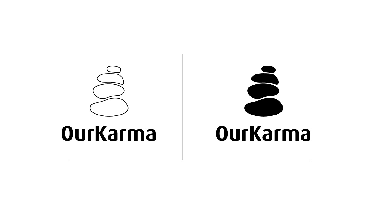
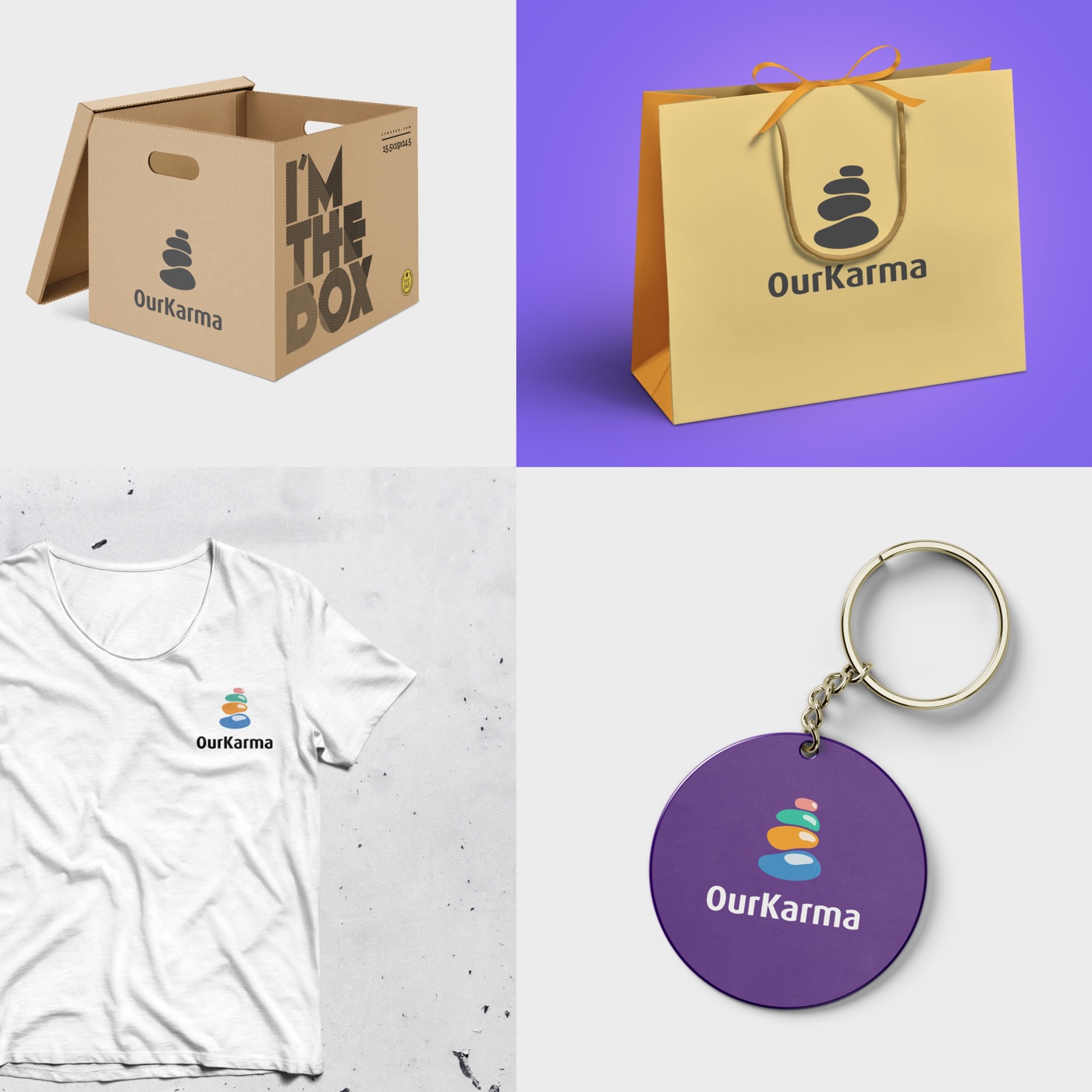
- A four-colour mark breaks easily, so I drew outline and solid one-colour versions for print, merchandise and small sizes.
- The name. Karma is the principle of cause and effect: good intent and good deeds lead to good outcomes. OurKarma makes it collective, and the stones show the path between challenges as progress made together.
- The colours. Each colour stands for part of the mission, such as blue for compassion and kindness and green for sustainability. Together, the rounded stones give the mark a sense of movement and energy.
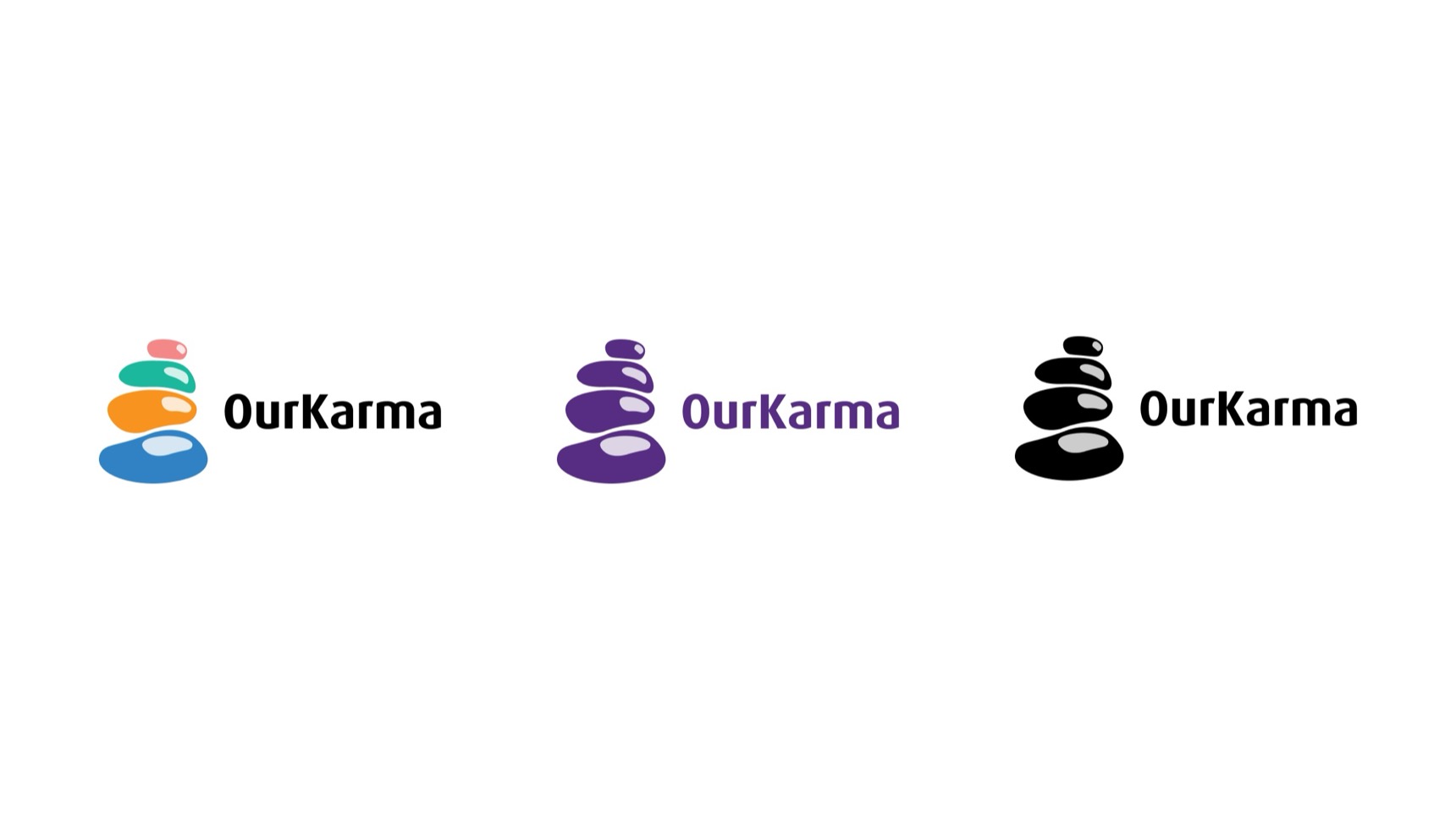
- Lockups. A stacked version for squares and social, and a horizontal version in full colour, violet and black for headers and narrow spaces.
- Rules. Always use the logo in full, never modify it, and keep it consistent with the rest of the identity.
03 / In the world
Built to be carried, worn and handed over.
Rewards on OurKarma are often physical, so the brand had to work off screen too: on donation boxes, gift bags, volunteer T-shirts and keyrings. The one-colour versions keep the mark legible on kraft and fabric; full colour is saved for places where it can shine.
Part two
The product
04 / Research · Empathise
People want to give. Knowing where is the hard part.
We set out to understand the needs and motivations of people who might use a charitable marketplace that rewards good deeds.
Why people give
- To help others. The most common reason, and the one people mentioned first.
- To feel good about themselves. Giving is also personal satisfaction.
- To make a difference in the world. People wanted their giving to add up to something visible.
- To earn rewards. Welcome, but an extra rather than the reason.
What gets in the way
- Not knowing where to start. People didn’t know where to find good deeds to do.
- Not enough time or resources. Researching causes felt like a project in itself.
- No way to track progress. Nobody could see what their giving had added up to.
What they asked for
- More variety. A wider choice of good deeds.
- More convenience. Easier ways to do them.
- Better tracking. A clear view of their progress and impact.
What we recommended, and where it went
- Variety
- Expand the range of good deeds on OurKarma. → Trending causes and featured topics on the home page.
- Local
- Make it easier to find good deeds nearby. → Search with local and global filters, and Find a match.
- Progress
- Let people track their progress and see the difference they make. → The donor dashboard’s impact graph and redeemed offers.
- Ease
- Make the interface simpler and friendlier. → Choose for me, for people who just want to give now.
05 / Competitive review · Empathise
Each competitor owned one kind of giving.
The charitable-marketplace space was growing quickly. Three platforms were closest to OurKarma, and each rewarded people for giving in some form.
- Goodr. Connects businesses with surplus food to non-profits that need it; donors earn points for giving food.
- Givebutter. A crowdfunding platform for many kinds of causes; donors earn points for giving to campaigns.
- Impact Hub. A global network of social enterprises; members earn points for taking part in activities.
I ran a SWOT analysis on the two closest, Goodr and Givebutter.
Goodr
- Strengths
- A strong community of food donors, a simple way to find donations and redeem rewards, and strong partnerships with businesses and non-profits.
- Weaknesses
- Only in a few cities, a narrow choice of rewards, and less brand recognition than its competitors.
- Opportunities
- Partner with businesses in new cities, add gift cards, merchandise and experiences, and grow awareness through campaigns and influencers.
- Threats
- Competition from Feeding America and FlashFood, changing regulations, and an economic downturn reducing food donations.
Givebutter
- Strengths
- A well-known, trusted brand, a wide range of features (donation pages, fundraising campaigns, event ticketing), and an easy setup.
- Weaknesses
- High fees, limited reach outside a few countries, and strong competition from GoFundMe and Kickstarter.
- Opportunities
- Expand to new countries, lower fees, and partner with social media platforms to reach more people.
- Threats
- Changing regulations, an economic downturn reducing donations, and new competitors taking market share.
Where OurKarma stood
- Strengths
- A focus on community (connecting, sharing stories, giving feedback), a wide variety of good deeds backed by businesses, non-profits and individuals, and a platform that makes it easy to find deeds, track progress and redeem rewards.
- Weaknesses
- A young platform with little brand recognition, available in only a few countries, and without a clear monetisation strategy yet.
06 / Persona · Define
Ashley wants to do more good, and to see that it worked.
Motivations
She wants to make a difference, and believes everyone can have a positive impact using their own skills and talents.
She gets real satisfaction from helping, and from seeing the effect her deeds have on people’s lives.
Pain points
She finds it hard to find good deeds to do, and often feels she lacks the time or resources for what she wants to do.
She can’t track her progress, so she never sees the difference her deeds are making.
Goals
Do more good, using her skills and talents to help others.
Track her progress, see her impact, and celebrate her successes.
Needs
A platform that makes good deeds easy to find, filtered by her interests and availability.
A way to see how her deeds are making a difference, and to celebrate them.
The goal. Help people like Ashley find the right cause in minutes, and show them what their giving achieved.
07 / User flows · Ideate
Three ways in, one way through.
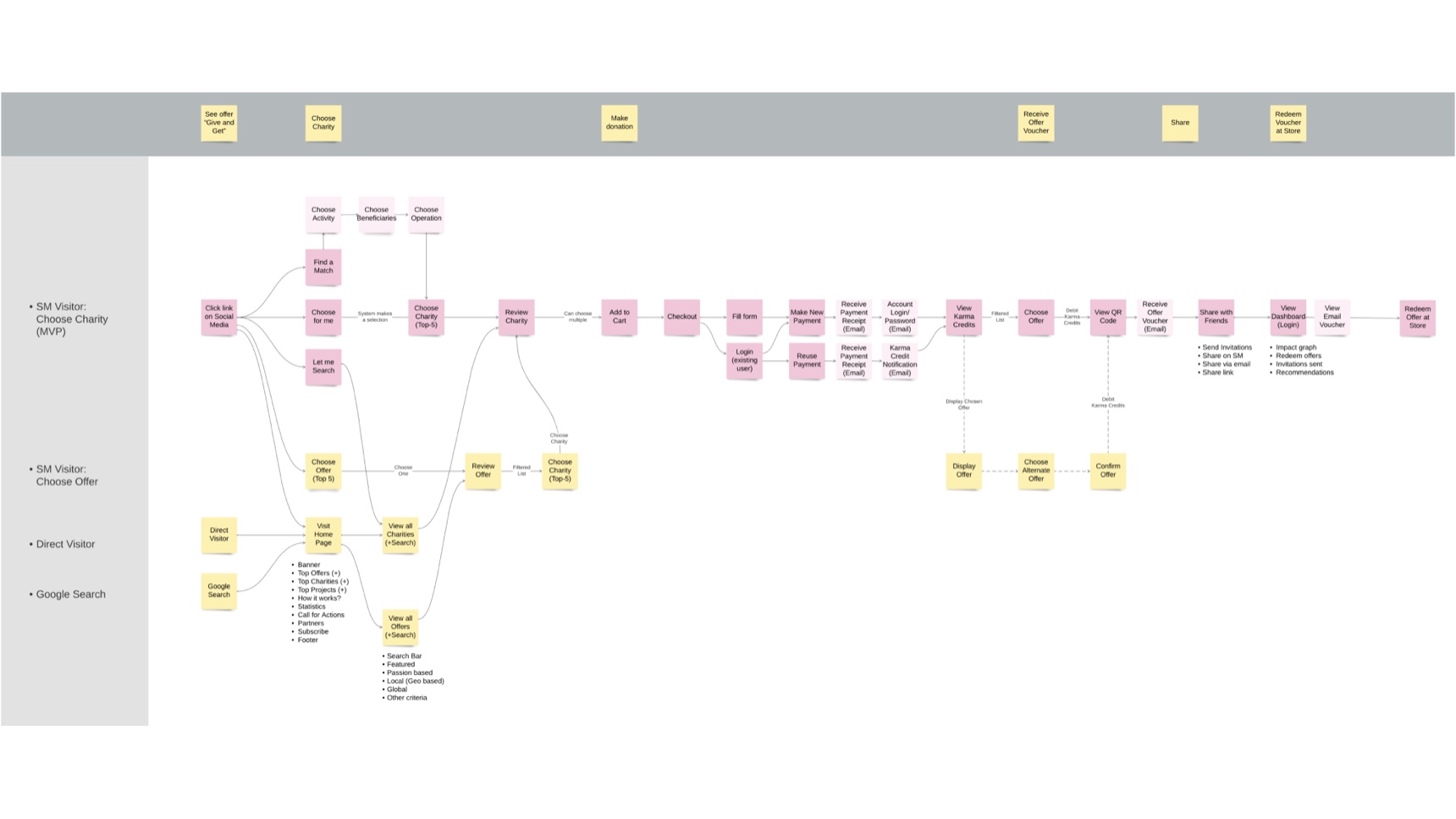
Visitors arrive from social media, from search or directly. I mapped the journey in Lucid so each of them had a short path to a cause, followed by one shared route to the reward.
- Find a match. Choose an activity, the beneficiaries and how to help, and get matched to an initiative.
- Choose for me. The system suggests five charities, for people who just want to give now.
- Let me search. Browse every charity and offer, filtered by featured, passion, local or global.
- Offer first. Visitors who arrive for a reward pick the offer, then a charity that unlocks it.
From there, every path meets: review, cart, checkout, karma credits by email, choose an offer, receive a QR voucher, share, and redeem in store.
08 / Website
Show the idea before explaining it.
Visitors needed to understand OurKarma at a glance. The hero leads with an illustration of people giving, which I drew in Procreate, then a search for initiatives or offers, trending causes, and the two quickest starting points: Find a match and Choose for me. The tone is professional, but written as a partner rather than a charity asking for money.
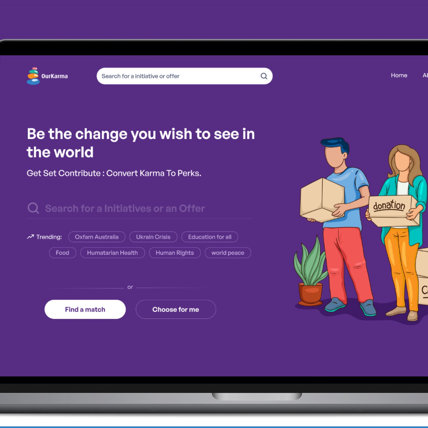
Be the change you wish to see in the world. Get set, contribute: convert karma to perks.
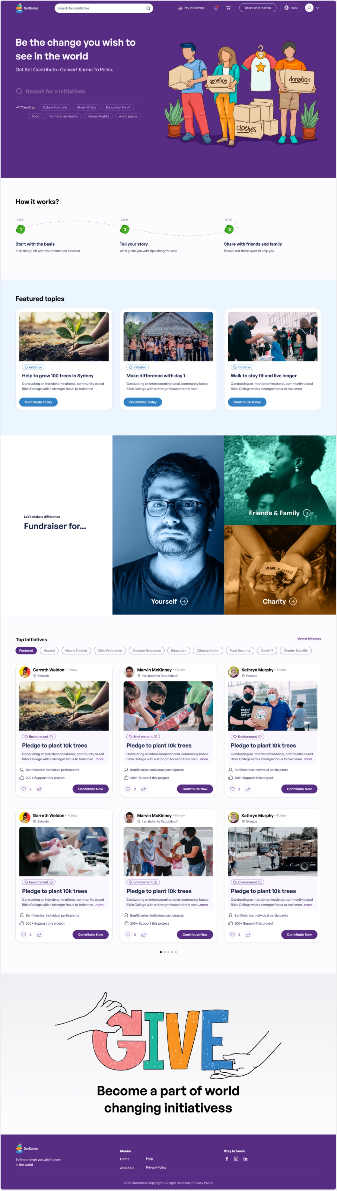
- Home page. How it works in three steps, featured topics, fundraising for yourself, friends or a charity, and top initiatives.
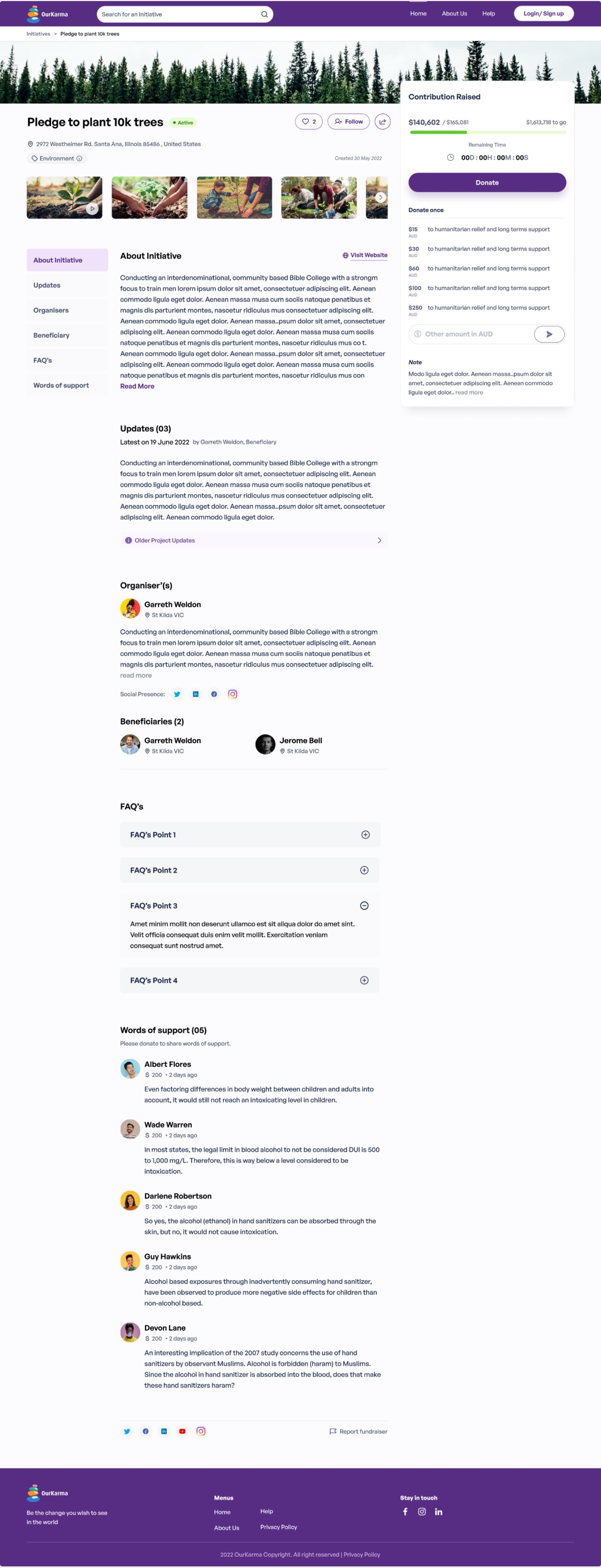
- Initiative page. Progress towards the goal and a donate panel stay in view, beside the story, updates, organisers, beneficiaries, FAQs and words of support.
- Trust. Charity profiles show verification, tax-deductible status, registration number and rating before anyone is asked to give.
09 / Design system and handoff
One file, from tokens to locked screens.
The Figma file covered every role: visitors before login, donors, brands and initiatives, plus beneficiary pages and donation pop-ups. Underneath sat a small system.
- Colour. Violet and the four stone colours, each in a 100–700 scale, plus accent scales for success, information, warning and error.
- Type. General Sans in four weights, from Display 56 down to Metadata 10, with separate web and mobile styles.
- Elevation. Shadow, drag and inner-shadow tokens for light and dark backgrounds.
- Handoff. Sections marked Locked or Under review, so developers always knew which screens were final.
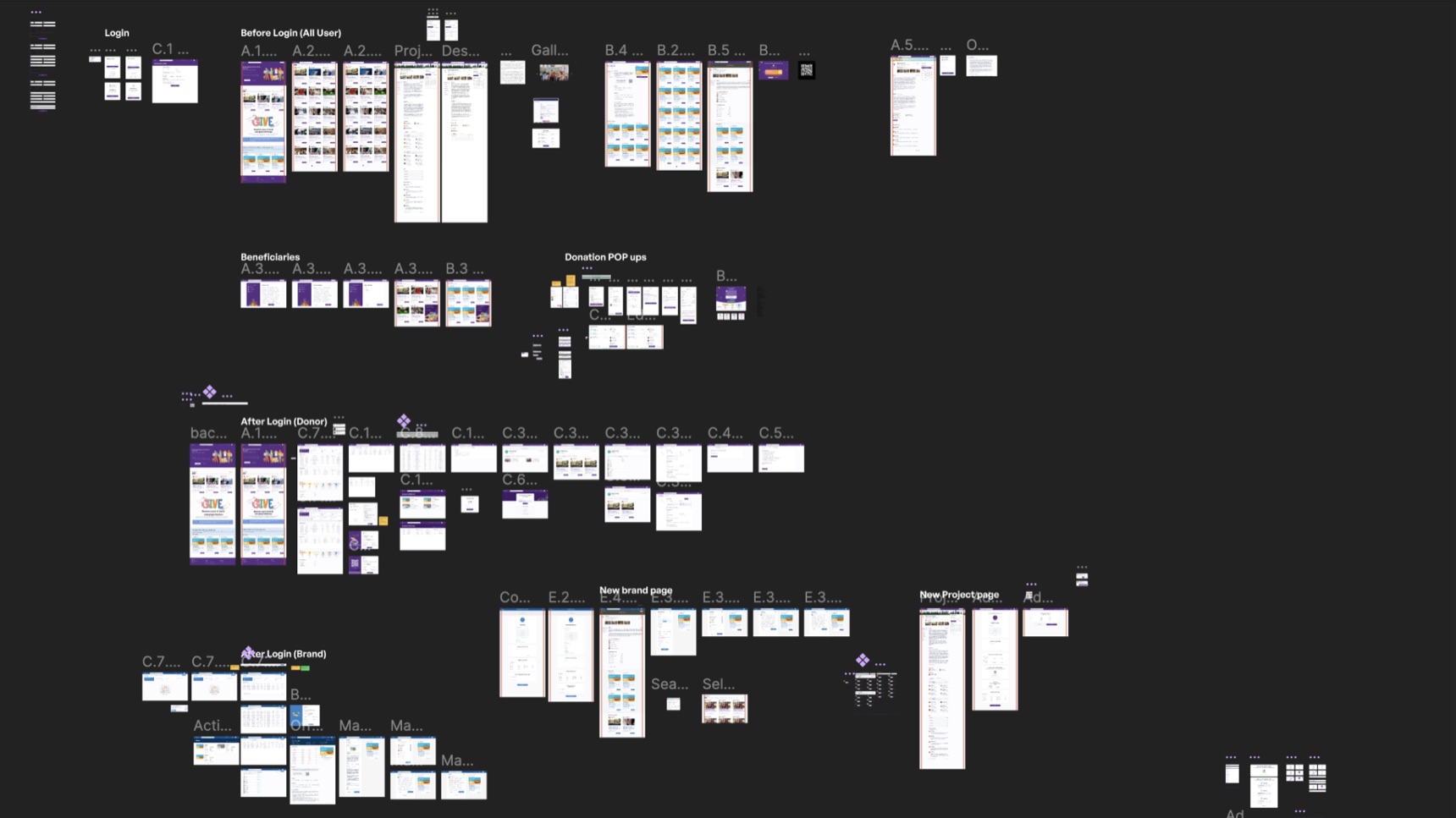
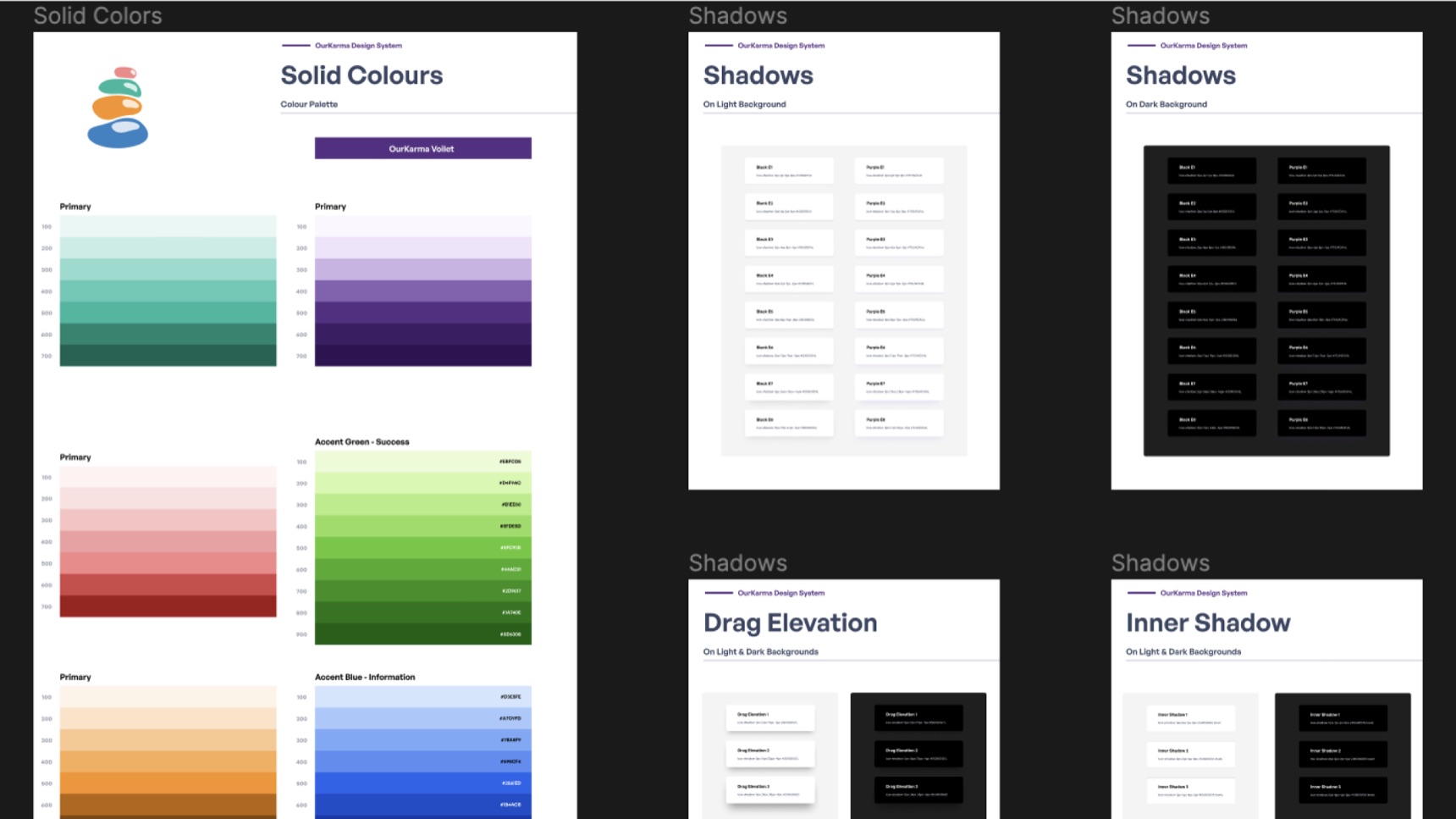
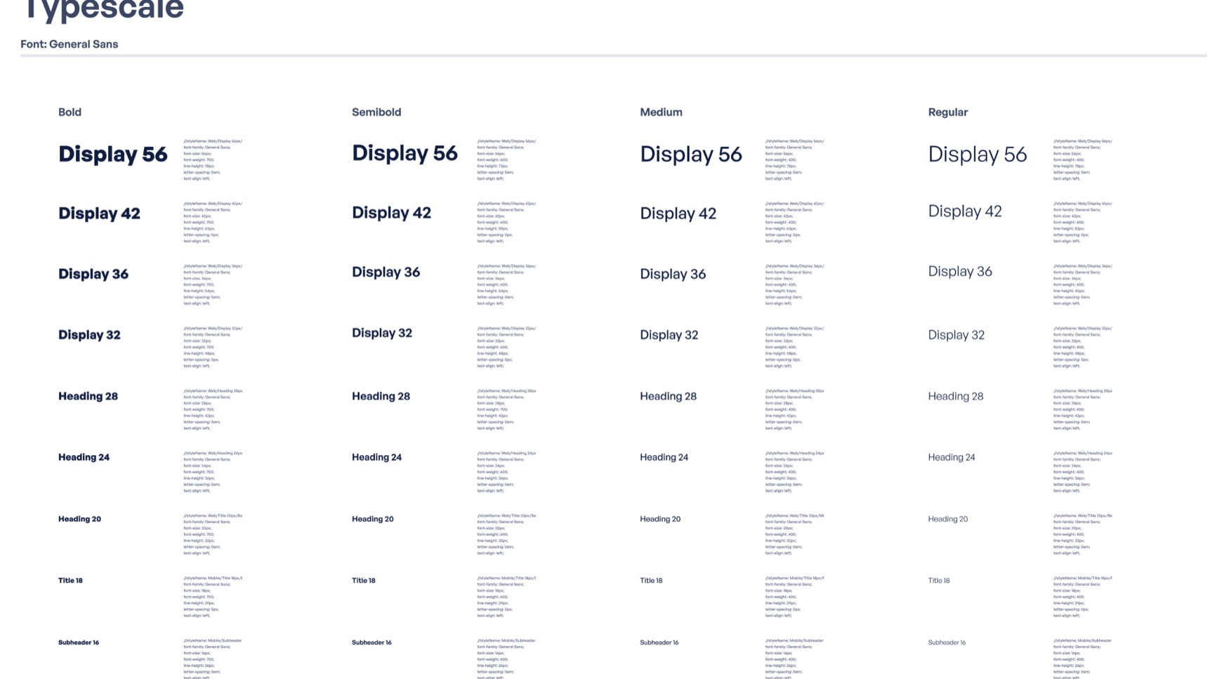
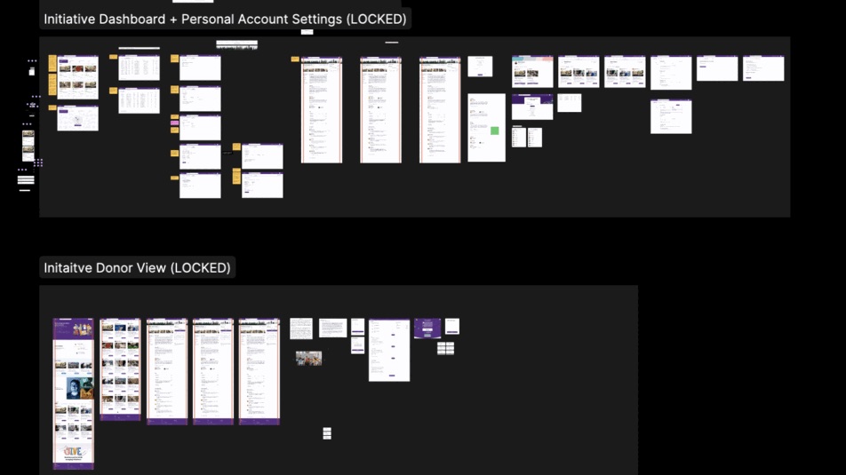
The high-fidelity Figma file, grouped by role: before login, donor, brand and initiative, plus beneficiaries and donation pop-ups.
10 / Outcome
Where it landed.
- Delivered
- Brand identity, illustrations, the full website design for donors, brands and initiatives, and a documented design system.
- Status
- The website launched and ran live; it has since been taken offline.
11 / Learnings
What I’d do differently now.
- Tie each finding to a screen. Research and design lived in separate chapters. Linking every finding to the decision it shaped makes the reasoning visible to clients and developers.
- Design the reward as carefully as the donation. Credits only motivate if the offers are worth having, so the partner side deserves the same attention as the giving flow.
- Let the mark carry the system. Taking the palette from the four stones kept brand and product in one visual language, and made later decisions faster.
Good ideas start with a conversation.
Start a conversationAway from the keyboard. I reply within a day.